
This week, I focused on readability and scale. As we now have four ways to look at the Newbery data (waffle chart overviews, race/ethnicity bubbles, race/ethnicity over time, and race/ethnicity by decade), our visualizations are becoming hard to navigate. So, I’ve played with the story feature of Tableau to reveal the data one layer at a time:
(Visit the Tableau Public viz for fuller functionality)
I also made parallel the color coding in the bubble charts, to make the data visually comparable from chart to chart.
In terms of scale, I began playing with the now nearly finished Caldecott data. My initial eyeballing had told me that the Caldecotts were more diverse, and they are, but hardly.
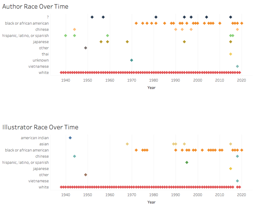
Initial visualizations of Caldecott author and illustrator race and ethnicity
As with the Newbery set, these initial visualizations revealed a host of input errors, as we humans had entered data inconsistently, despite our best efforts to stick to pre-defined categories. So, I spent some time cleaning, though there’s still more to do and little time in which to do it. (You’ll notice in the above image, for example, the label of “Asian,” which is not a Census option).
Trickier still, the Caldecott awards are for illustrated works, which means that an honored book may have two or more creators. If we separate authors from illustrators, do we re-enter author data if they themselves are the illustrators, thereby over-representing their identity? Or, do we separate authors from illustrators, reducing the effect of the fact that perhaps readers of different backgrounds may find themselves represented in the authorship of the same book?
Those are the pressing issues as we wrap up our work this week. Also pressing is how best to contextualize our work in writing on our website. We are struggling as a team to balance when we are speaking to our intended audience and when we are appealing to academics who may already have a stake in our work. We are also grappling, as all data visualizers do, with when to compromise accuracy for the sake of clarity. For example, do we remove unidentifiable authors from the set? Do we distinguish between animal and non-animal protagonists? Do we continue to devote precious hours to the elusive authors and protagonists for whose identity we have scoured the web, CUNY’s online resources, and even the Social Security Death Index records?
One of our biggest questions throughout this project has been how we can label identity in a way that communicates to parents, educators, and librarians identity markers that may help children see themselves and others in books. Those labels are inherently flawed, especially as they are being applied over a century of data. We are experimenting with “she” and “he” as our gender categories, since those binary pronouns are the ones readers will encounter in author bios and in the texts themselves, but, of course, we have also committed to Census categories for race and ethnicity, which readers don’t encounter.
It is my hope that while the data brings up these problems, our site proposes a solution: choosing widely from the myriad book awards that actively seek to remedy the dangers of homogenous authorship.

This entry is licensed under a Creative Commons Attribution-NonCommercial 4.0 International license.