Category Archives: Personal Blogs

Meg Williams Bio

Meg Williams is a student at the CUNY Graduate Center Program for Digital Humanities and holds an MFA in Poetry from Hunter College, where she worked as an adjunct lecturer and a substitute administrative coordinator. With this background, Meg explores the intersection of art and technology through digital poetics. She is currently working as a project coordinator for the New York Public Interest Group at Queens College, where she works on issues such as higher education affordability and campus sustainability.

Her main role in the Newbury project is outreach. She is particularly interested in issues around the importance of minority representation, the concept of whiteness, the economy of prizes and their ancient origins. Meg hopes her explorations of these topics will contextualize her groups finding in a critical analysis of the Newbury Prize.

Kelly’s Reflection: Week of 4/19 – 4/26

This week, I focused on readability and scale. As we now have four ways to look at the Newbery data (waffle chart overviews, race/ethnicity bubbles, race/ethnicity over time, and race/ethnicity by decade), our visualizations are becoming hard to navigate. So, I’ve played with the story feature of Tableau to reveal the data one layer at a time:

(Visit the Tableau Public viz for fuller functionality)

I also made parallel the color coding in the bubble charts, to make the data visually comparable from chart to chart.

In terms of scale, I began playing with the now nearly finished Caldecott data. My initial eyeballing had told me that the Caldecotts were more diverse, and they are, but hardly.

Charts of Caldecott author and illustrator race and ethnicity over time

Initial visualizations of Caldecott author and illustrator race and ethnicity

As with the Newbery set, these initial visualizations revealed a host of input errors, as we humans had entered data inconsistently, despite our best efforts to stick to pre-defined categories. So, I spent some time cleaning, though there’s still more to do and little time in which to do it. (You’ll notice in the above image, for example, the label of “Asian,” which is not a Census option).

Trickier still, the Caldecott awards are for illustrated works, which means that an honored book may have two or more creators. If we separate authors from illustrators, do we re-enter author data if they themselves are the illustrators, thereby over-representing their identity? Or, do we separate authors from illustrators, reducing the effect of the fact that perhaps readers of different backgrounds may find themselves represented in the authorship of the same book?

Those are the pressing issues as we wrap up our work this week. Also pressing is how best to contextualize our work in writing on our website. We are struggling as a team to balance when we are speaking to our intended audience and when we are appealing to academics who may already have a stake in our work. We are also grappling, as all data visualizers do, with when to compromise accuracy for the sake of clarity. For example, do we remove unidentifiable authors from the set? Do we distinguish between animal and non-animal protagonists? Do we continue to devote precious hours to the elusive authors and protagonists for whose identity we have scoured the web, CUNY’s online resources, and even the Social Security Death Index records?

One of our biggest questions throughout this project has been how we can label identity in a way that communicates to parents, educators, and librarians identity markers that may help children see themselves and others in books. Those labels are inherently flawed, especially as they are being applied over a century of data. We are experimenting with “she” and “he” as our gender categories, since those binary pronouns are the ones readers will encounter in author bios and in the texts themselves, but, of course, we have also committed to Census categories for race and ethnicity, which readers don’t encounter.

It is my hope that while the data brings up these problems, our site proposes a solution: choosing widely from the myriad book awards that actively seek to remedy the dangers of homogenous authorship.

Kelly’s Reflection: Week of 4/12 – 4/19

This week I realized one huge, albeit obvious, difference between One Week | One Tool and DH70002: time. There must have been something quite liberating in the parameter of just one week’s worth of work. Granted, the intensity, publicity, and level of that experiment far surpass ours, yet I find myself envying the breakneck hastiness of that endeavor.

We, by contrast, have had weeks and weeks and weeks. But life has changed dramatically over that stretch of time. For me, for my group, and for our audience. I’m now a virtual teacher, and I live with five people instead of one. Our team has had brushes and direct hits with COVID-19. And our project has taken on greater meaning, as reading books has provided human connection for kids in a world struggling to isolate itself.

So, with just a few weeks before our final presentation, I find myself uneasy. Mostly because I’m just not sure which of the many decisions before me is most important—which warrants the greatest, last-ditch effort. We had originally planned to create a printable poster for librarians and educators to hang on their walls. They may not see those walls (or those printers) for quite some time. We wanted to broaden our scope to the Caldecotts. But, if they tell the same story (which it seems they do), is our time better served improving the power and reach of our Newbery visualizations? Ah, Hamlet. We get why you are so enduring.

My work in the last week has only strengthened my indecision. Following Micki’s advice, I made some good progress, creating a calculated field to sort the race and ethnicity of Newbery authors and protagonists by decade. Some parallel tree maps now chart the gross disproportion of whiteness across chunks of time, and clear tool tips help make the point that only in the last 20 years have we seen any real nod toward writer diversity. I added source notes to the visualizations as well and tackled some of the last few unknowns in our data.

That in place, I reached out for feedback to the inimitable Steven Zweibel—a particularly apt critic given his triple roles as DH guru, librarian, and father of a young reader. Like some Koan master, he answered questions with questions, prompting me to investigate the philosophy of tree maps, to present our data in different (albeit unnamed) ways, and to communicate with our users more fully. I tried the bubble charts below and retooled some older bar charts.

Bubble charts depicting race/ethnicity data of authors and protagonists

A stab at bubble charts for greater visual impact.

Then the team weighed back in during our weekly meeting, defending some of our original choices and embracing some of the new additions. And now, we’ll repeat the whole thing as we take this tweaked version to Meg’s contact at the NYPL, librarians at my school, and, hopefully, children’s lit folks at CUNY. Here’s how we stand now:

var divElement = document.getElementById(‘viz1587341718454’); var vizElement = divElement.getElementsByTagName(‘object’)[0]; if ( divElement.offsetWidth > 800 ) { vizElement.style.width=’1000px’;vizElement.style.height=’2427px’;} else if ( divElement.offsetWidth > 500 ) { vizElement.style.width=’1000px’;vizElement.style.height=’2427px’;} else { vizElement.style.width=’100%’;vizElement.style.height=’3377px’;} var scriptElement = document.createElement(‘script’); scriptElement.src = ‘https://public.tableau.com/javascripts/api/viz_v1.js’; vizElement.parentNode.insertBefore(scriptElement, vizElement);

Fortunately, all this angst has an upside: we can share it on the website and social media. We discussed in our meeting how we can tap into recent articles on Census deadline postponement to express our displeasure at its racial categories. We noted that some of the big questions our data has presented (is Pam Muñoz Ryan really “other” by Census standards?) provide a teaching opportunity. And we recognized that there are some gem stories that are begging to be spotlighted (what Johanna Drucker would call the “capta” trapped within the “data”).

Despite my indecision about next steps, I’ve promised the team I’d play with the Caldecott data this week, as it is nearly ready. As in the game of horseshoes, that’s good enough for a Tableau start. I’ll have to fight my own intellectual wanderlust, though, as some recent vizzes in Tableau’s gallery have me dreaming about a Sankey chart connecting authorship to protagonist identity. All I need is time…

Kelly’s Reflection: Week of 3/30 – 4/5

This week was all about loosening what had become a tight focus on getting required tasks done. It started with the in-class critique of our project presentation which nudged me to return to the more expansive “What if?” thinking with which we launched the project. Micki suggested really playing with the visualizations in counterfactual ways. What if we don’t represent whiteness in the graphics?* What if we push back against the census categories?

My initial play with the first question was deflating: in both protagonist and author graphs, an early award winner of color makes the removal of the “nearly solid bar” of data representing whiteness not considerably more interesting than with it. So, I’ll need to play around this week with conditional statements that sort awardees by decade or that translate our race/ethnicity data into more equitable categories than the Census divisions.

Also widening my scope was my videoconference with GC Digital Fellow Rafael Portela to review the python code I’d created to scrape Caldecott awardees. While the Newbery scrape yielded data just as I’d hoped, the two Caldecott scrapes resulted in messier .csv files that required loads of cleaning. I’d turned to Rafael (Rafa) in hopes of figuring out whether that mess was a result of the architecture of the sites’ HTML or my code.

Our meeting underscored what DH is all about: a manner of thinking more than an amalgamation of skills. Having asked me to send him the python files in advance, Rafa began by saying, “I haven’t done any data scraping with python myself.” But, he had already played with the files I’d sent, and he had looked at my code less as a data scraper than as a text parser. He asked just the right questions to get me thinking about ways my code might have been more efficient and effective.

He did indeed confirm that the sites’ HTML was what caused my Caldecott scrapes to be messy. But, he also helped me identify two ways that I might have counteracted that. First, he noted that using the element inspector in Chrome reveals a little more about the architecture of the site than merely viewing the source code. (It turns out that there was a hidden attribute in the anchor tags of the Madison Public Library site that would have helped me grab both medal winners and honorees in one go, though I still would have had a lot of cleaning to do.)

He also pointed out that using python not just for scraping but also for cleaning would have been wise. Using regular expressions to parse the data may have resulted in clean columns of year of award, title, author, and illustrator (if different from the author). He also pointed me to Beautiful Soup’s documentation to consider ways to handle multiple attributes of scraped tags in the future.

If our group has time or if we continue the project beyond the scope of the semester, I’m hoping to try using regular expressions to parse scraped data in code rather than relying on Excel’s text-to-columns feature and a lot of post-scraping work. Meanwhile, I’ll continue to do research to fix our current data set (this week, I got rid of ? and null values in the protagonist data), and I’ll start to push our visualizations further as Georgette and Emily finish up the Caldecott research.

*Actually, Georgette had suggested this in last Sunday’s team meeting, so it was a double nudge from Micki.

Kelly’s Reflection: Week of 3/23 – 3/29

As our group continues to do its research, a data story is emerging: children’s book awards can be beneficial, providing exposure and longer shelf life to quality books, but with that power, they can neglect important voices and provide longer shelf life to societal inequality. This week, I focused on how we might start to tell that story of our data through visualizations.

Two weeks ago, I created a set of four waffle charts about the Newbery Awards that statically celebrate* one extreme (the number of female authors at nearly 70%!) while exposing the shocking other extreme (that less than 10% of authors were people of color). So, this week’s task was to think about what our audience would want to see next. Perhaps they might want to dive into why female authorship is so high. Has authoring children’s books been considered largely a motherly, and therefore gendered, office? Have societal roles provided women more experience selecting and reading children’s books, thereby giving them an edge and a path into the market? Were selection committees more female than male? If female authorship is so high, why are protagonists only 30% female? All of the questions seemed interesting, and I did some research to see if there may be a compelling reason to find and present data to answer them.

The research was pretty fascinating. Perhaps my favorite find was that the selection committees seem to have been exclusively female until 1964, when Spencer G. Shaw, an African-American male librarian, entered the scene and continued to sit on the committee for four years. He seems to have opened up the committee to male participation, though that body of deciders remained largely female, even up to 2020.

Another highlight of my research was a 2011 study from Florida State University focused on a far broader selection of children’s books published throughout the 20th century. Its findings confirmed that the Newbery awardees, at least in terms of the gender of the protagonists, mirrored larger children’s book publishing trends as well as trends among other media, such as cartoons. Among the study’s many interesting finds, a news summary about the study shares that “males are central characters in 57 percent of children’s books published per year, while only 31 percent have female central characters”—nearly the same ratio in Newbery Awards. The study itself also affirmed the purpose of our investigation, noting: “Adults also play important roles as they select books for their own children and make purchasing decisions for schools and libraries…Therefore combating the patterns we found with ‘feminist stories’ requires parents’ conscious efforts. While some parents do this, most do not” (219).

But, since women already comprised the majority of authors and female protagonists were at 30%, I thought the racial disparity might be the more important next step. More than questions about gender, I thought readers might be eager to understand more deeply the startling statistic about authors of color.

I assumed that the first question on our users’ minds might be whether authorship has gotten more diverse over time, so I created a visualization to answer that question. I included a filter so that our users could determine if there was more author diversity in the Honors, as opposed to the Medals themselves, and I added information in the tool tip to help users identify quickly the specific books and authors represented by each data point—hopefully to promote the books by authors of color. Those tool tips also offer additional race/ethnicity data beyond what the US census categories allow, hopefully shedding light on both the oddity of the census categories and a tiny bit of diversity within the white authors themselves (as some white authors are Jewish or come from recently immigrated families from European countries). What I think is most effective about the chart is how clearly it illustrates that the Civil Rights era changed the scene. Only two authors of color appear prior to 1969—Indian-American author Dhan Gopal Mukerji and African American author Arna Bontemps. From 1969 on, the picture is rosier for black authors (moreso than any other group of color), but the awards remain clearly and heavily skewed toward white writers. As Georgette put it during our feedback session, there’s practically a solid line of white authorship throughout the history of the awards.

For contrast, I created a graph of protagonists’ races over time—a very different constellation of data points, and one that begs the question of who has been given license to write about whom over time. Here’s how it looks right now:

(Or, explore it on Tableau Public.)

Tonight, my group provided helpful feedback, and, after I make some changes, we’ll start to get outside critiques this week. I’m eager to make sure that the choices we make are those that benefit our users—choices that help them decide how to let these awards inform their own selections as they pick books for their collections, students, and kids.


*While such a majority might not feel like cause to celebrate—after all, wouldn’t it be great if a fuller spectrum of gender was represented and if author gender mimicked, proportionally, society?—the Newberys were created only two years after women received the right to vote. So, we celebrate that the awards seemed to be a consistent and viable place of recognition for women in a century that was far less equitable to them. (Interestingly, the FSU study does note that the percent of female protagonists is slightly higher during years of greater awareness of women’s issues on the national political stage.)

Heritage Reconstructed research update


I want to reflect about what we have done in the research area since the beginning of the semester. I haven’t seen it yet in the webpage because we have our group meeting tomorrow, but I know that Ashley and Chris uploaded the first two VRs on our website, which is exciting. One of the discussions we had at the beginning of the semester aimed to define what criteria we would consider for searching and mostly for selecting what VRs will be included in our database. We knew that what is available is not a reason per se, and even if we wanted to include what is available, we needed to find a narrative that explains why this is a reason for including a VR in our database.

Our aim was to create a Virtual Reconstruction database of archeological sites or objects. Since this was still too broad, we decided to focus on archeological sites in peril due to environmental damages, armed conflict or war, lack of investment in its preservation, earthquakes and other natural disasters, pollution, and poaching. This delimitation of the scope of the sites that we include in our database is important because it gives our project a strong conceptual lens and a clear standpoint to engage our VR digital project with the VR projects already being developed by different individual and institutions: scholars in universities, people in the game industry, artists, start-ups, among others. The second discussion we had is whether we would focus on a country and region of the world, and whether we would focus on a particular historical period. We decided to leave these options open and it turn out to be a good decision, which will be explained below. The third discussion we had is whether we would include natural sites in danger, e.g., parks, besides archeological sites or objects in peril. We decided to include only VRs of archeological sites, that is, sites that required human intervention and creation, for example, architecture, art, and/or religious buildings. Once we defined these criteria, the purpose of our VR digital project became much clear for all of us, not only in a practical sense, but rather it gave us a better understanding of the project we wanted to create. We needed also a new name, which is: Heritage Reconstructed: Virtualizations of Sites in Peril.

We began by exploring UNESCO Word Heritage in danger list. The list includes 53 sites in danger and includes cultural (archeological) sites and natural sites. We only focused on archeological sites. We made a search of VRs available online country by country, using different key words to make the search. Having completed the search following the UNESCO’s list, we identified two patterns: one, there are not many VRs for the sites the UNESCO considers in danger. Second, the VRs available are about countries and archeological sites that come from the same geographical region and mostly are in danger, or were destroyed, by war and terrorist groups, e.g., Irak, Libya, Syria, and Afghanistan.

We also included VRs sites that randomly appeared in our search thanks to the work of a wise algorithm. We found VRs that are publicly available, but also VRs that were created by the game industry; by start-ups, such as ICONEM, which dedicates to the digitization of endangered cultural heritage sites; Rekrei, a crowdsourced project, which also creates 3D representations of sites in danger; and CyArc-ICOMOS-Google created five VRs of sites taken from UNESCO list, which are mostly in danger due to climate change. We still have to figure out whether we will be able to upload the VRs these organizations have in their sites in our digital project or we will have to include just the link.

As noted previously, Ashley and Chris uploaded two VRs in our website. The following task for us is to review the VRs we have collected and decide which ones we will include, and contact the organizations I mentioned before, which have many VRs on archeological sites in peril, and ask them whether they allow us to upload their VRs in our website.


Kelly’s Reflection: Week of 3/16 – 3/22

This week was all about bandwidth and RAM, both literal and metaphorical. I had trouble connecting to our class’s Tuesday Zoom session—certainly a matter of too many devices and too many programs demanding too much of a limited Internet connection in my getaway in Kentucky. I also had trouble working on the visualizations this week—certainly a matter of too many worries and too many plans to make demanding too much of a brain that would ordinarily be on spring break, my annual reboot.

So, eager not to hold my team back with my distractedness, I turned to low-level but time-consuming tasks: scraping and cleaning data. Our team is interested in comparing our current data set of Newbery authors and protagonists to data about other awards. So, I scraped the basics on the next most recognizable children’s book honor: the Caldecotts, which recognize excellence in picture books.

The scraping experience reminded me that most online python tutorials work with best-case scenarios. The videos that taught me how to scrape earlier this semester drew from huge, well-established websites (the New York Times and monster.com) to demonstrate the power of the code. The few sites offering a full list of Caldecott winners were less established, and the HTML was erratic at best. The site from which I scraped the Caldecott honorees fortunately organized those winners in lists, so I could find all <li>, but within those lists, they only sometimes embedded the title in anchor tags, and they often included manual spacing and tabs for no apparent reason. About half of the time, the books were illustrated by someone other than the author, so splitting the results by the word “by,” as I was able to do for the Newberys, got tricky. So, my code just grabbed the titles and attempted to grab authors, resulting in a two-column .csv file in desperate need of real cleaning—a far cry from the comparatively tidy results of the Newbery scrape. But that kind of cleaning—split screening the data and the original site and checking manually for errors—was exactly the kind of mindless labor I needed. Now, we’ve got the years, titles, authors, and illustrators, and already, without further research, we can see that the Caldecotts are much more diverse than the Newberys. But of course, further research is what we now need as we identify author and protagonist gender and race/ethnicity more precisely.

Another great boon this week: Meg reminded us that what we’re doing matters. She crafted an initial blog post for our website intended to remind our users that as children consume books in isolation—away from school and peers and the outside world—that parents need to make sure that those pages reflect themselves and others. If children only read from a small slice of the literature available, they will be isolated indeed. We hope our project can help parents make well-informed decisions this spring, when reading might be, in some ways, the only contact kids have with the outside world.

(On a side note, I’ve remembered this week what we learned last term in the Intro to DH class: that the data infrastructure in the US allows us access to our jobs and each other in this time of crisis in a way that few other countries’ infrastructure can. I’m wondering how we might use that access to support those without it. Thoughts?)

Kelly’s Reflection week of 3/9 – 3/16

Ode to Tableau, Part II

Last week, I extolled the virtues of Tableau, but I forgot one of my favorites: the open nature of Tableau Public. Thanks to the learn-with-us ethos of the site, the brilliant vizzes shared on the galleries are available to download and deconstruct. So, this week, I downloaded the public notebook of the site our team found most inspiring and germane to our work. I got to see how the data visualizer added her own text around the visualizations—something I had never done. I also got to explore the structure of her tooltips, which will allow me to include (eventually) some of the data worth exploring beyond our first glance.

This user’s work reminded me how simple and powerful waffle charts can be in conveying part-of-whole information to users. So, I used hers as models for how to share our data on author and protagonist gender and race/ethnicity. Then, in the playful nature of children’s literature and our audience of teachers, parents, and librarians, I created some icons in Illustrator to heighten engagement. (I did an online tutorial in Illustrator last summer, and was surprised what came back to me. Still, I’m very new.) And, I borrowed the color scheme from Emily’s great choice of graphics on the WordPress site she created.

Here’s what I have at this point:

Newbery Award Waffle Charts

The waffle charts weren’t easy for me, even though I had created one once before. I had to watch the first few minutes of a tutorial to refresh my memory. Even then, I had typos, which made for some holey waffles. I also miscalculated mathematically, thinking that a 10 x 10 waffle wouldn’t show less than 10% well, so I made a 20 x 20 grid—more work than I needed to do (and that I will most likely undo this week).

Further, because I knew the data from the bar charts, I was able to detect some flaws in the code that creates the calculated fields behind waffle charts. For example, the nonwhite protagonist percent is way too high. Right now, the code I created that decides if a protagonist is nonwhite reads:

IF [Protagonist Race/Ethnicity] != “white”
THEN “1”
END

Our intent with that chart is to show the number of human protagonists that aren’t white, but the code includes a nonhuman protagonist or a book with no protagonist in the count, inflating the percentage. The inverse is true with the female protagonist percentage which is currently too low, as the code counts only books with single protagonists that are female, not those with multiple protagonists that include a female. So, I’ll be tweaking this week, fixing these errors, incorporating feedback from my team, and exploring additional visualizations.

Kelly’s Reflection: Week of 3/2 – 3/9

This week’s post is an ode to Tableau, or at least to data visualization. If you haven’t gotten to play with process yet, let me share why I’ve come to love automated data viz.

The Magical
It doesn’t matter how well you know your data: the viz can surprise you. The data we scraped with Python (title, author, year), we didn’t know very well. But, the gender and race/ethnicity info, for both authors and protagonists, we had gathered painstakingly by hand—researching, categorizing, rethinking. We knew that data like we knew our own selves, and we had already drawn two basic conclusions: first, that the slight majority of Newbery authors were female, and second, that a greater majority of authors were white. But, once popped into the simplest of bar graphs in Tableau, the data stunned me. The awards are suffocatingly white—authors and protagonists alike. There’s no chance a kid of color could find herself in many of the books—in the pages or on the spine. Worse, there are more protagonists of color than authors of color, and we’ve already started to rely on Tableau’s tool tips to call attention to surprisingly recent white authors speaking to a nonwhite experience.

Newbery authors and protagonists by race/ethnicity

Screenshot of authors and protagonists by Census Bureau race/ethnicity. Note that yellow merely indicates Newbery Medal status, while gray indicates Honor status. White authors occupy the top row of the upper graph; white protagonists occupy the top from of the lower graph.

The early vizzes also pointed out that while there are more female authors, there are more male protagonists than female, so boys can see themselves more as the center of a story where the women are the spinners of them—something we hadn’t thought about.

The early visualizations also spoke, sadly, to the truth that it didn’t matter which of the racial/ethnic lenses we chose (though we went with the Census Bureau’s, so that we could make a point about its limitation). No lens would change the fact that white is the reality of the Newbery authors and characters.

The Mundane
Even if your first vizzes don’t yield these startling insights, automating visualizations in programs like Tableau can help identify errors in your data. And boy, did we have errors. Some were because we are human and make typos. Because we recorded our data in separate Google sheets, I made different decisions than Georgette and Emily when it came to issues that arose beyond the data’s architecture we had planned. While I thought I had caught and adjusted for them all as I merged their medal winners with my honors winners, Tableau said otherwise. Its agnostic eye registered white, wite, and White as three distinct races. We had other variances, such as how we registered our own doubt (?, ??, ???, and not sure), how we managed nonhuman protagonists’ genders and races/ethnicities (n/a, NA, and none), and how we categorized books with multiple or no protagonists (multiple, many, family, or male and female).

Yes, each exposed mistake meant more work. But often, the solution required returning to the very purpose of our project. What do we want to communicate, for example, about books with multiple protagonists? Is it more important to highlight the identities of center-stagers or ensemble casts? Did slicing the data of books with more than one protagonist into types of multiplicity clarify or fracture our findings? These are all great questions that we can start to answer with our user in mind.

The Message
This week, while I address the last of the data errors, I’ll begin the next fun (and scary) part: moving from simple visualizations to those that can really grip our audience, inviting them to explore for themselves. I browsed Tableau’s galleries for inspiration and found two in particular that I love: a woman’s personal reading history and a breakdown of gender and political affiliation in the House of Representatives. The former appeals to me because it is both interactive and powerful as a set of static images. Our group hopes to share with our users a printable poster to hang on a library or faculty room wall or to take to their principals, so this model looked pretty good. The government visualization was intriguing for its display of the same data in different ways, each geared to raise a different set of questions.

As we prepare to provide content for the website Emily is building, we know that the decisions we’ve made with the data and the early vizzes in Tableau will help shape our message and our direction. Already, in our weekly meeting, we’re discussing what other data we might gather—perhaps about other awards—that can help our users make good decisions, whether that’s the American Library Association who bestows the annual awards or librarians, educators, or parents as they make purchasing decisions.

Kelly’s Reflections: Week of 2/24 – 3/2

This week my primary task was to finish collecting the identity data on Newbery Honor authors and protagonists while Emily tackled the Medal winners—tasks that can’t (or at least shouldn’t) be automated given the sensitive and interpretive nature of determining gender, race, and religion. Unlike the web-scraped details of dates and titles and authors, determining race and gender often included consulting illustrations or original cover art, author websites or obituaries, or reading the first chapter or two of a book.

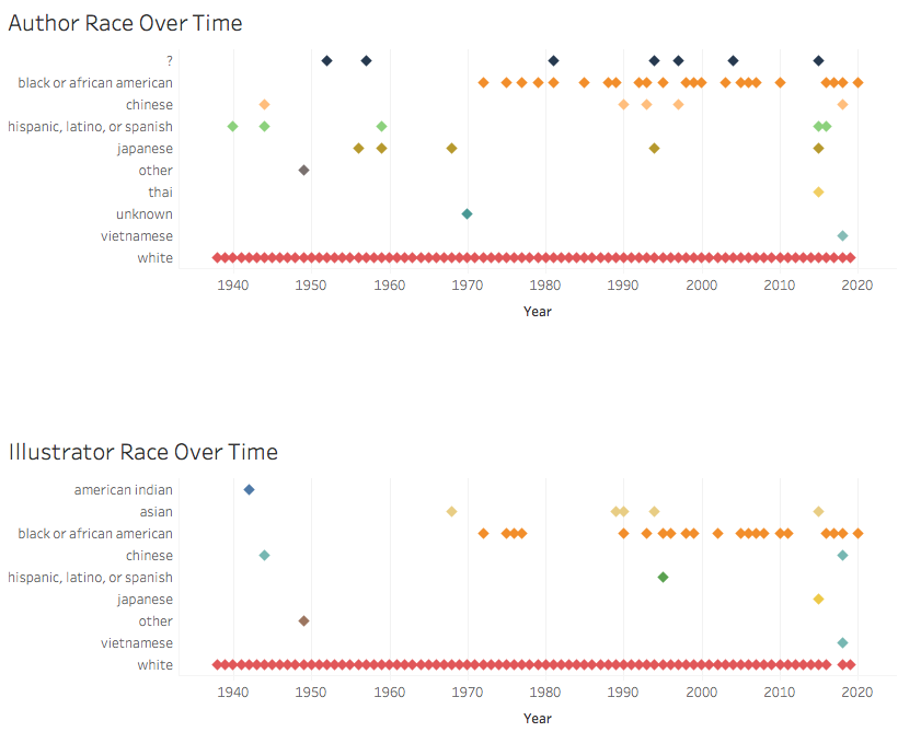
As I gathered details, I also read some articles, both academic and popular, about the categorization of race and ethnicity. The reading highlighted for me that our project is really about whether the Newbery awards, as influential as they are in personal and institutional purchasing decisions and readership, have offered a variety of authors and protagonists in which kids could see themselves in literature. While, in some ways, we entered this project assuming that they didn’t, I found that, as I recorded hundreds of white protagonists and authors, the question of race and ethnicity was more about white versus nonwhite than distinctions of nonwhiteness. What was startling to me (and won’t be to anyone pursuing critical race studies) is that being white in these books or in author bios is often a matter simply of not being something else. Jewish authors were identified as such. Black protagonists, miserably, were often revealed through nonstandard English, African settings, or drug-dealing American neighborhoods. Black writer’s bios touted “the first African American to…” unlike their white counterparts who boasted interests in knitting or meditation or gardening. For the majority of the history of the awards, being white and non-Jewish is, in essence, the default character or author; being anything else is the variation.

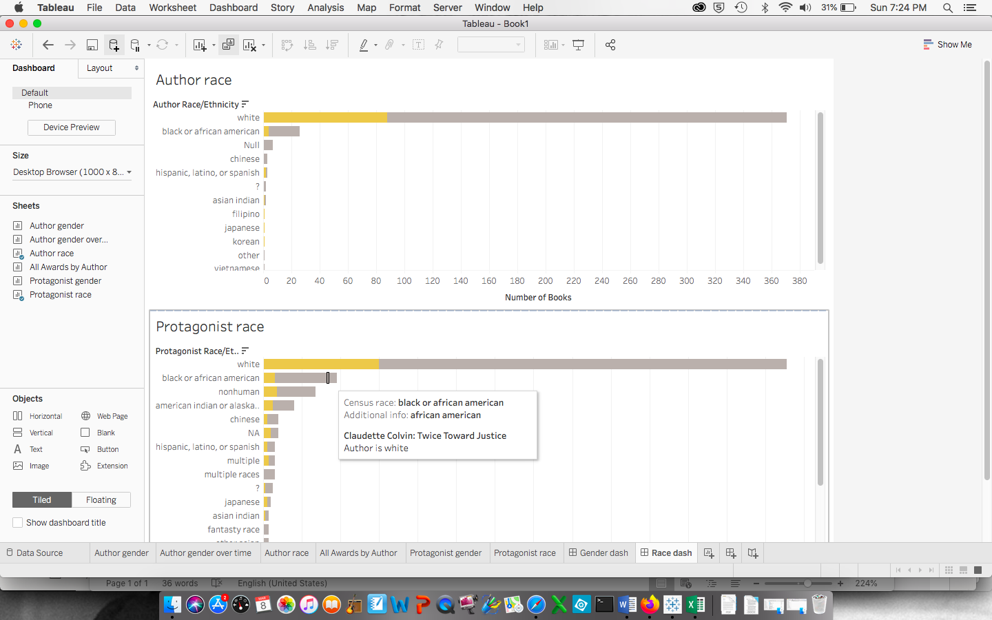
This experience led us to decide that we will play with the data in two ways. Option one is to categorize the authors and protagonists by identifying whiteness and nonwhiteness, with layers of nonwhiteness available to our audience through further exploration with our interactive model. The second is to present the data through the flawed lens of the US Census Bureau, a model that allows us to talk about the slippery concept and powerful, lived realities of the social construction of race.

Some of our research pushed against our expectations. In some cases, Newbery Honorship did not, as we had assumed, guarantee immortality. Some early titles are out of print, and some authors or titles are not yet granted popular regeneration through Wikipedia. By contrast, the system sometimes seems to replicate itself, as the American Library Association, which created the awards, has created new awards in honor of some of its honorees. For example, the ALA granted Laura Ingalls Wilder, who received five Newbery Honors, an award of her own, which many Newbery authors, such as E.B. White and Beverly Cleary, have since received. (Her honor was, in 2018, renamed the Children’s Literature Legacy Award amidst controversy about her depictions of indigenous and black Americans, but until then, it propelled her—a Newbery author—as yet another standard of children’s literature. The renaming might have signaled to the ALA the flaw in their replicated machine.)

One deeply disturbing trend seems clear: Newbery status for diverse books seems sacrosanct for some. Take the case of Jamake Highwater, an honoree boasting Native American heritage who wrote Anpao: An American Indian Odyssey. In the 1980s, Highwater was exposed as a fraud—not indigenous at all—and he lost all federal funding as a result. Yet his book still sells, for $7.98, on Amazon, the cover brandishing its Newbery Honor, despite the wealth of incredibly fine work for kids by indigenous authors such as Joseph Bruchac and Tim Tingle.

While we are still a few days away from our first Tableau experiments with the data, one thing is sure: we’ll want to find ways (perhaps through Tableau’s storyboards or tool tips or perhaps through other sections on the website) to highlight the many unusual stories. Some winning authors are married to or are children of other winners. Some winning stories are about children from countries authors have only visited. Some winning authors share prestigious illustrators, such as Maurice Sendak.

Regardless of our direction in the next month, I realized this week that I wish that our course started with a literature review. I found, midway through this research, a book cataloging Newbery Medalists and Honorees (replete with author and plot info) that I’ll borrow from the CUNY library to double-check our research. Had Emily and I known the book existed, we might have saved ourselves some precious time. A literature review might also have saved us time in terms of deciding racial and ethnic categories in our data ahead of time, which we’ll now have to take time cleaning again.

One issue on my mind for the coming weeks is that of our collaborator’s agreement. The four of us are kind, flexible people, and so far, we’ve been trying to help each other a little more than owning a task and sticking to it. We’ve battled illnesses and tech issues, full time jobs and trips, and while we are making good progress, I’m not sure we’re functioning as leanly as we had anticipated when we first divvied out roles and expectations. We’re torn between wanting to learn all aspects of this project (as we hope to grow as DHers from this project) and wanting to meet weekly project goals to produce something powerful and fine. We’re already on our way to communicating more clearly: we’ve adjusted our weekly meeting time to better suit the group’s schedules. That’s a big step for aw-shucks warm-and-fuzzy people like us.

Margael’s bio

Margael St Juste is a digital humanities student at the CUNY graduate Center. She earned her undergraduate degree in History and a minor in Economics with honors. She completed her independent research thesis on the Hitler-Stalin Non-Aggression Pact of 1939 detailing the reciprocity of influence between the two regime leaders in the interim world war period. She also completed relevant projects on black identity, black scholarship, and middle east studies. In her current academic pursuit Margael is focusing on 20th and 21st century neocolonial systems and practices through the political paradigms of self-determination and sovereignty. Margael hopes to use digital tools and platforms to enrich scholarly conversation on these topics and to build technologies of access and visibility for other digital humanists with neocolonial barriers.

Margael is the outreach coordinator for the Heritage Reconstructed project which is dedicated to digital and virtual reconstruction of sites in peril. She is responsible for all external communication with academics and digital scholars, including those whose work are the foundation of our project. In addition, she promotes public conversation about the project on social media platforms as well as within digital humanities spaces. She is also responsible for optimizing pages for online search engines.