
This week’s post is an ode to Tableau, or at least to data visualization. If you haven’t gotten to play with process yet, let me share why I’ve come to love automated data viz.
The Magical
It doesn’t matter how well you know your data: the viz can surprise you. The data we scraped with Python (title, author, year), we didn’t know very well. But, the gender and race/ethnicity info, for both authors and protagonists, we had gathered painstakingly by hand—researching, categorizing, rethinking. We knew that data like we knew our own selves, and we had already drawn two basic conclusions: first, that the slight majority of Newbery authors were female, and second, that a greater majority of authors were white. But, once popped into the simplest of bar graphs in Tableau, the data stunned me. The awards are suffocatingly white—authors and protagonists alike. There’s no chance a kid of color could find herself in many of the books—in the pages or on the spine. Worse, there are more protagonists of color than authors of color, and we’ve already started to rely on Tableau’s tool tips to call attention to surprisingly recent white authors speaking to a nonwhite experience.
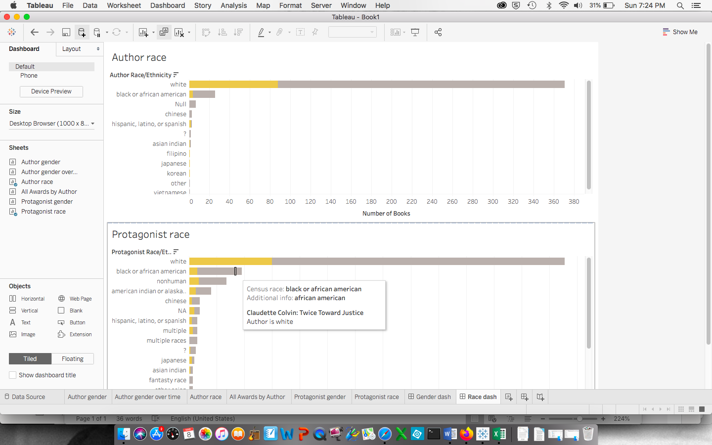
Screenshot of authors and protagonists by Census Bureau race/ethnicity. Note that yellow merely indicates Newbery Medal status, while gray indicates Honor status. White authors occupy the top row of the upper graph; white protagonists occupy the top from of the lower graph.
The early vizzes also pointed out that while there are more female authors, there are more male protagonists than female, so boys can see themselves more as the center of a story where the women are the spinners of them—something we hadn’t thought about.
The early visualizations also spoke, sadly, to the truth that it didn’t matter which of the racial/ethnic lenses we chose (though we went with the Census Bureau’s, so that we could make a point about its limitation). No lens would change the fact that white is the reality of the Newbery authors and characters.
The Mundane
Even if your first vizzes don’t yield these startling insights, automating visualizations in programs like Tableau can help identify errors in your data. And boy, did we have errors. Some were because we are human and make typos. Because we recorded our data in separate Google sheets, I made different decisions than Georgette and Emily when it came to issues that arose beyond the data’s architecture we had planned. While I thought I had caught and adjusted for them all as I merged their medal winners with my honors winners, Tableau said otherwise. Its agnostic eye registered white, wite, and White as three distinct races. We had other variances, such as how we registered our own doubt (?, ??, ???, and not sure), how we managed nonhuman protagonists’ genders and races/ethnicities (n/a, NA, and none), and how we categorized books with multiple or no protagonists (multiple, many, family, or male and female).
Yes, each exposed mistake meant more work. But often, the solution required returning to the very purpose of our project. What do we want to communicate, for example, about books with multiple protagonists? Is it more important to highlight the identities of center-stagers or ensemble casts? Did slicing the data of books with more than one protagonist into types of multiplicity clarify or fracture our findings? These are all great questions that we can start to answer with our user in mind.
The Message
This week, while I address the last of the data errors, I’ll begin the next fun (and scary) part: moving from simple visualizations to those that can really grip our audience, inviting them to explore for themselves. I browsed Tableau’s galleries for inspiration and found two in particular that I love: a woman’s personal reading history and a breakdown of gender and political affiliation in the House of Representatives. The former appeals to me because it is both interactive and powerful as a set of static images. Our group hopes to share with our users a printable poster to hang on a library or faculty room wall or to take to their principals, so this model looked pretty good. The government visualization was intriguing for its display of the same data in different ways, each geared to raise a different set of questions.
As we prepare to provide content for the website Emily is building, we know that the decisions we’ve made with the data and the early vizzes in Tableau will help shape our message and our direction. Already, in our weekly meeting, we’re discussing what other data we might gather—perhaps about other awards—that can help our users make good decisions, whether that’s the American Library Association who bestows the annual awards or librarians, educators, or parents as they make purchasing decisions.

This entry is licensed under a Creative Commons Attribution-NonCommercial 4.0 International license.