
Ode to Tableau, Part II
Last week, I extolled the virtues of Tableau, but I forgot one of my favorites: the open nature of Tableau Public. Thanks to the learn-with-us ethos of the site, the brilliant vizzes shared on the galleries are available to download and deconstruct. So, this week, I downloaded the public notebook of the site our team found most inspiring and germane to our work. I got to see how the data visualizer added her own text around the visualizations—something I had never done. I also got to explore the structure of her tooltips, which will allow me to include (eventually) some of the data worth exploring beyond our first glance.
This user’s work reminded me how simple and powerful waffle charts can be in conveying part-of-whole information to users. So, I used hers as models for how to share our data on author and protagonist gender and race/ethnicity. Then, in the playful nature of children’s literature and our audience of teachers, parents, and librarians, I created some icons in Illustrator to heighten engagement. (I did an online tutorial in Illustrator last summer, and was surprised what came back to me. Still, I’m very new.) And, I borrowed the color scheme from Emily’s great choice of graphics on the WordPress site she created.
Here’s what I have at this point:
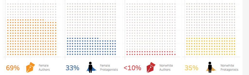
The waffle charts weren’t easy for me, even though I had created one once before. I had to watch the first few minutes of a tutorial to refresh my memory. Even then, I had typos, which made for some holey waffles. I also miscalculated mathematically, thinking that a 10 x 10 waffle wouldn’t show less than 10% well, so I made a 20 x 20 grid—more work than I needed to do (and that I will most likely undo this week).
Further, because I knew the data from the bar charts, I was able to detect some flaws in the code that creates the calculated fields behind waffle charts. For example, the nonwhite protagonist percent is way too high. Right now, the code I created that decides if a protagonist is nonwhite reads:
IF [Protagonist Race/Ethnicity] != “white”
THEN “1”
END
Our intent with that chart is to show the number of human protagonists that aren’t white, but the code includes a nonhuman protagonist or a book with no protagonist in the count, inflating the percentage. The inverse is true with the female protagonist percentage which is currently too low, as the code counts only books with single protagonists that are female, not those with multiple protagonists that include a female. So, I’ll be tweaking this week, fixing these errors, incorporating feedback from my team, and exploring additional visualizations.

This entry is licensed under a Creative Commons Attribution-NonCommercial 4.0 International license.