
This week I realized one huge, albeit obvious, difference between One Week | One Tool and DH70002: time. There must have been something quite liberating in the parameter of just one week’s worth of work. Granted, the intensity, publicity, and level of that experiment far surpass ours, yet I find myself envying the breakneck hastiness of that endeavor.
We, by contrast, have had weeks and weeks and weeks. But life has changed dramatically over that stretch of time. For me, for my group, and for our audience. I’m now a virtual teacher, and I live with five people instead of one. Our team has had brushes and direct hits with COVID-19. And our project has taken on greater meaning, as reading books has provided human connection for kids in a world struggling to isolate itself.
So, with just a few weeks before our final presentation, I find myself uneasy. Mostly because I’m just not sure which of the many decisions before me is most important—which warrants the greatest, last-ditch effort. We had originally planned to create a printable poster for librarians and educators to hang on their walls. They may not see those walls (or those printers) for quite some time. We wanted to broaden our scope to the Caldecotts. But, if they tell the same story (which it seems they do), is our time better served improving the power and reach of our Newbery visualizations? Ah, Hamlet. We get why you are so enduring.
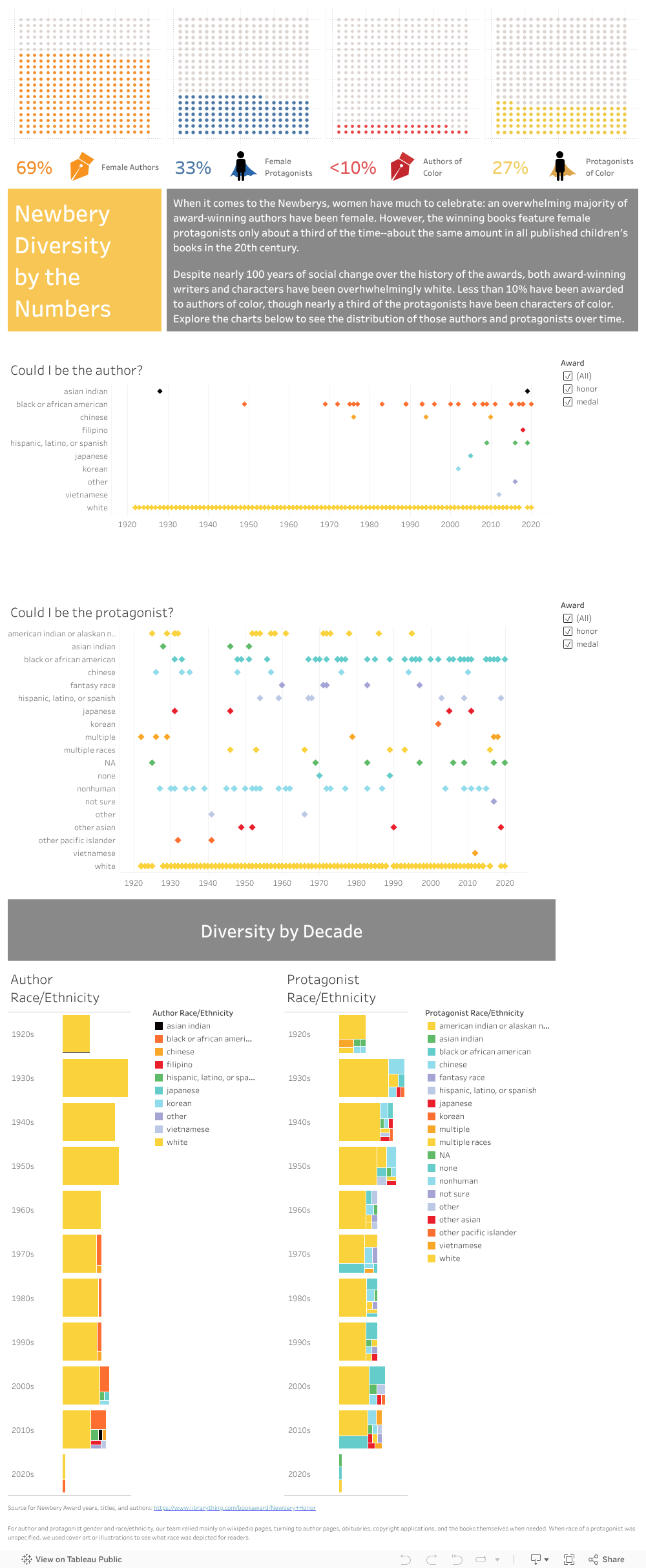
My work in the last week has only strengthened my indecision. Following Micki’s advice, I made some good progress, creating a calculated field to sort the race and ethnicity of Newbery authors and protagonists by decade. Some parallel tree maps now chart the gross disproportion of whiteness across chunks of time, and clear tool tips help make the point that only in the last 20 years have we seen any real nod toward writer diversity. I added source notes to the visualizations as well and tackled some of the last few unknowns in our data.
That in place, I reached out for feedback to the inimitable Steven Zweibel—a particularly apt critic given his triple roles as DH guru, librarian, and father of a young reader. Like some Koan master, he answered questions with questions, prompting me to investigate the philosophy of tree maps, to present our data in different (albeit unnamed) ways, and to communicate with our users more fully. I tried the bubble charts below and retooled some older bar charts.
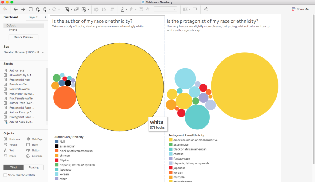
A stab at bubble charts for greater visual impact.
Then the team weighed back in during our weekly meeting, defending some of our original choices and embracing some of the new additions. And now, we’ll repeat the whole thing as we take this tweaked version to Meg’s contact at the NYPL, librarians at my school, and, hopefully, children’s lit folks at CUNY. Here’s how we stand now:
var divElement = document.getElementById(‘viz1587341718454’); var vizElement = divElement.getElementsByTagName(‘object’)[0]; if ( divElement.offsetWidth > 800 ) { vizElement.style.width=’1000px’;vizElement.style.height=’2427px’;} else if ( divElement.offsetWidth > 500 ) { vizElement.style.width=’1000px’;vizElement.style.height=’2427px’;} else { vizElement.style.width=’100%’;vizElement.style.height=’3377px’;} var scriptElement = document.createElement(‘script’); scriptElement.src = ‘https://public.tableau.com/javascripts/api/viz_v1.js’; vizElement.parentNode.insertBefore(scriptElement, vizElement);
Fortunately, all this angst has an upside: we can share it on the website and social media. We discussed in our meeting how we can tap into recent articles on Census deadline postponement to express our displeasure at its racial categories. We noted that some of the big questions our data has presented (is Pam Muñoz Ryan really “other” by Census standards?) provide a teaching opportunity. And we recognized that there are some gem stories that are begging to be spotlighted (what Johanna Drucker would call the “capta” trapped within the “data”).
Despite my indecision about next steps, I’ve promised the team I’d play with the Caldecott data this week, as it is nearly ready. As in the game of horseshoes, that’s good enough for a Tableau start. I’ll have to fight my own intellectual wanderlust, though, as some recent vizzes in Tableau’s gallery have me dreaming about a Sankey chart connecting authorship to protagonist identity. All I need is time…

This entry is licensed under a Creative Commons Attribution-NonCommercial 4.0 International license.