Who Wins With Book Awards? An exploration of the gender, ethnic, and racial origins of prize winners and the characters they create, with a focus on children’s literature

Group Members

Kelly Hammond, Developer/Researcher: Kelly’s responsibilities for this project include automating data collection where possible with Python, researching Newbery award winners, cleaning data for analysis, and creating interactive visualizations of the data in Tableau.

Georgette Keane, Project Manager: Georgette serves as the Project Manager, which includes managing the project and creating a detailed project schedule to ensure completion by the established deadline. She is also responsible for providing support to the other team members, including assisting with data collection and establishing connections with children’s literature professionals and librarians.

Emily Maanum, Designer/User Experience: Emily serves as the Designer/User Experience lead. In conjunction with the Outreach Coordinator, as well as the rest of the team, Emily developed and now maintains the project’s website so it may continue to be useful and informative for the project’s audience. Her other tasks include assisting with data collection and contributing to the project’s outreach.

Meg Williams, Outreach Coordinator: Meg’s main role in the project is outreach. She is responsible for the curation of the blog, the majority of its writing, and the project’s social media strategy. On a conceptual level, she is particularly interested in the importance of minority representation, concepts of whiteness, and the economy of prizes.

Project Narrative

Overview

Diversity and authentic representation matter, especially in children’s literature. As literary scholar Rudine Sims Bishop noted 30 years ago, “When children cannot find themselves reflected in the books they read, or when the images they see are distorted, negative, or laughable, they learn a powerful lesson about how they are devalued in the society of which they are a part.” W.E.B. Du Bois intimated a similar idea in a 1919 edition of the Crisis magazine where he laid out his plan to publish The Brownies Book—a magazine created expressly for children of color—two years before the Newberys were established. Similarly, a study on gender in 20th-century children’s literature points out that “cultural representation, including that in children’s literature, is a key source in reproducing and legitimating gender systems and gender inequality.”

It probably is not surprising that recent studies have shown an overall lack of diversity in children’s books. According to the Cooperative Children’s Book Center (CCBC), of the three thousand books published in 2018, fifty percent of books featured a white protagonist, twenty-seven percent of books featured an animal protagonist, and African/African American, Asian Pacific Islander/Asian Pacific American, Latinx, and American Indians/First Nations protagonists completed the remaining twenty-seven percent. While there have been initiatives created by the American Library Association (ALA) and children’s book publishers to address this issue, no full study has been made into the efficacy of these initiatives. To remedy this, we must consider the books children are exposed to and examine the ways in which these books get into their hands.

School and public libraries offer children and their caregivers access to more books than they could purchase for themselves. Libraries also feature carefully curated sub-collections that allow children to locate stories that they relate to and that can help them understand and deal with sensitive topics. More people are going to public libraries each year. According to the 2016 Public Libraries Survey Report by the Institute for Museum and Library Services, more than 171 million registered users visited public libraries over 1.35 billion times in 2016. Even with this increase in patrons, librarians often deal with limited budgets and shelf space, so books must be carefully chosen. Librarians often rely on book lists and reviews for guidance on purchasing, and Newbery and Caldecott Medal and Honor books top these lists. Educators and parents are similarly influenced as they cultivate smaller collections for their classrooms and homes, so even absent a library visit, children are still influenced by these prizes.

First awarded in 1922 to encourage original creative work in the field of books for children, the Newbery Medal is awarded to the author of the “most distinguished contribution to American literature for children” (ALSC). The author must be a citizen or resident of the United States, and the book must be published by an American publisher in the United States in English during the preceding year. First awarded in 1938, the Caldecott Medal was created to honor the artist of the “most distinguished American Picture Book for Children” (ALSC). The artist must be a citizen or resident of the United States, the illustrations must be original works of the artist, and the artist can also be the author of the book. The Newbery and Caldecott Medals are the most distinguished awards presented to children’s books, and studies have shown that after the winners are announced, book sales can increase up to 1,000% (Cockcroft). Book sellers have a vested interest in the significance of the awards and often prominently display these books in shops. The award on the cover drives sales, and the sales reinforce the significance of the award.

Not only is the general public purchasing these books, but so are public and school libraries as well as classroom teachers. Honorees are highlighted on ALA websites and accompanying book lists, and librarians often feature honorees in their display areas and programming. Children become exposed to these works that may or may not help them to understand and handle situations that deal with diversity in religion, race, gender, etc. These books, for better or worse, usually stay on library shelves much longer than other books due to their status as honorees. As one head of children’s services states, “I don’t weed Newbery and Caldecott winners…I feel like if you win the Newbery or Caldecott, you kind of have immortality as a book. I just won’t do it” (Yario).

Since the Newbery and Caldecott Medal and Honor Books hold such sway over the public and librarians, we decided to analyze the 763 Newbery and Caldecott ‘Honorees’ (both Medal winners and Honor books) to discover if these books provided an array of diverse backgrounds and whether any diversity was a recent development. We collected the gender and racial/ethnic data of the Honoree authors, illustrators, and protagonists and used Tableau to create visualizations for our audience to explore. We are sharing our findings and recommendations through our website, blog posts, and Twitter.

Our objective with this project is to educate the public on the nature of these prestigious awards. Librarians and educators can use the visualizations to argue for more funding to purchase a wider array of books which fully encompass the experience of their patrons, since our findings reveal that award-winners lack diversity of representation for authors, illustrators, and protagonists. Parents can start to question the primacy of these awards, looking at awardees in more depth and investigating our recommendations for other organizations that promote more inclusive narratives.

Environmental Scan

Who Wins with Book Awards? (WWWBA) is a unique project in the field of children’s literature. Other projects focus on analyzing diversity in the most recent children’s books or create book lists that focus on a particular group or theme. The Cooperative Children’s Book Center releases annual statistics examining diverse authors and protagonists in overall books published the previous year. There are journals—both online and in-print—that investigate diversity, such as the Research on Diversity in Youth Literature (RYDL), a peer-reviewed online journal hosted by St. Catherine University’s Master of Library and Information Science Program and University Library. Librarians, aware of the lack of diversity in literature, will often create public programming to highlight books on diversity or create LibGuides, like Michigan State University Libraries.

The publishing community has recognized the general lack of diversity and has started new initiatives to tackle the issue. Scholastic created the catalog The Power of Story that offers recommendations for books representing diversity of race, sexual orientation, gender identity, and physical and mental abilities. By creating the catalog, Scholastic hopes that young people will have the opportunity to “see themselves and their communities reflected, to read widely, and to understand and expand their world.” Book publisher Lee & Low created The Open Book Blog, a blog on race and diversity in children’s books. Guest contributors discuss current issues and will promote books published by Lee & Low.

In regards to digital projects focusing on diversity in children’s books, the Diverse Book Finder collects information on picture books that feature black and indigenous people and people of color (BIPOC) from 2002 to the present. The themes given on the site are Genre, Categories, Settings, Tribal Affiliation/Homelands, Immigration, Gender, and Race/Culture. An issue with the site is that it only tracks fiction and narrative nonfiction picture books from 2002 and only books with suggested reading levels kindergarten through grade three.

The only digital project found that features diversity and the Newbery and Caldecott Award Books is Lisa Bartle’s Database of Award-Winning Children’s Literature. The database has over 14,000 records from 158 awards worldwide. Bartle, a reference librarian, researches award winners and regularly adds them to the database. Visitors can search by keyword for books or by certain fields like award won or author’s gender.

Although these projects bring awareness to the issue of diversity in children’s literature, WWWBA offers an interactive analysis of all Newbery and Caldecott Honorees. Users can explore the history of the awards and find books that offer diverse content. They can also start to ask questions about the role those awards play in shaping their own (and our country’s) book choices. It is the longitudinal nature of our data that makes our study unique, as we visualize the trends for the last nearly 100 years. For example, we saw that periods such as the Civil Rights Era of the 1960s boasted an uptick in diversity but these periods were often followed by a return to white winners and honorees. We hope to bring other patterns like this to light.

Audience

Our primary audience for this project contains parents, educators, and librarians, as we hope to influence the purchasing decisions that radically shape what books children have access to. We were eager to uncover trends in what are regarded as the most prestigious awards—the Newberys and Caldecotts—hoping to comment on the appropriateness of their hegemony. Our project’s primary purpose is to help purchasers, those gateways to literature, understand the degree to which relying on these awards may limit children’s ability to see themselves in books or to see an array of diverse people or experiences. 

By visiting our website and investigating our visualizations, parents, educators, and librarians can re-evaluate the role that the awardees play both in what gets purchased and how long a book stays in circulation, be it on a family’s bookshelf, in the classroom, or at the library. They can also take advantage of two tools we offer for diversifying their collections: tooltips that point them to books whose authors or protagonists have particular identities, as well as a list of other children’s book awards that celebrate more diverse writers and characters. Further, by reading our blog posts, our child-facing audience can deepen their understanding of issues of identity, history, and narrative. 

Project Activities:

Project Timeline: 

Feb 19th-March 19th:

  • Research the ramifications of racial and ethnic categories for authors and protagonists
  • Build Python program to scrape Newbery Honors winners.
  • Research author and protagonist gender and race/ethnicity for the Newberys.
  • Begin playing with early data in Tableau.
  • Draft outline of website: each page (Home, About, Methods, Data, Social Media, Suggested Reading, Infographic), using WordPress through Commons.
  • Set up social media and email accounts. RT news on diverse books.

March 20th-April 19th:

  • Create Python program to scrape Caldecott Medal and Honor winners.
  • Research author and protagonist gender and race/ethnicity for the Caldecotts.  
  • Combine data sets and create new, interactive visualizations..
  • Finalize website design and add to pages; Start blogging.
  • Continue RT content on diverse books/child literacy. 

April 20th-May 5th:

  • Mine the visualizations for content. Continue posting blogs.
  • Share revised visualizations and site to test group for feedback.
  • Make adjustments to visualizations after initial feedback.
  • Reach out to collaborators and audience on social media to announce the published project.

Goals and Adjustments

Our original proposal was to examine diversity in the 415 Newbery Medal and Honor Books. Our work plan consisted of three stages: gathering the data, organizing the data into the pre-approved format, and analyzing the data using the visualization software Tableau. We collected the data using a program we built in Python that scraped the Honorees information from selected websites and generated it into a .csv file. We then cleaned and exported the data to a Google Spreadsheet that the entire team could work in. The data was organized into the following categories: Organization, Award, Year, Title, Author, Author’s Gender, Author’s Race/Ethnicity, Protagonist(s) Gender, Protagonist(s) Race, and Protagonist(s) Ethnicity/Identity. Once cleaned, the data was entered into Tableau to create interactive visualizations.

Gathering the Newbery data took less time than expected, so we expanded the project to include the Caldecott Medal and Honor books. We collected the same data we did for the Newbery Honorees but added the following categories: Illustrator, Illustrator’s Gender, and Illustrator’s Race/Ethnicity. Shortly after our decision, New York shut down due to COVID-19, and we were unable to borrow books from the library. We relied on alternate sources, like YouTube read-alongs and digital newspapers, to find creator and protagonist identities. With these new hurdles, the Caldecott data collection took longer than expected, and as a result, we were unable to share visualizations on our Instagram account prior to public launch. We were active on Twitter, sharing content about the project and diverse creators. As we continue with the project, we will use Instagram to share our visualizations and graphics. 

Accomplishments

When starting this project, we wanted to create a product that was useful and understandable to parents, educators, and librarians. Our team’s product consists of a website dedicated to our findings and a Tableau Public workbook that contains our data visualizations. We built our website using WordPress through the CUNY Academic Commons. We wanted to engage our audience with the colorful design found on our site and visualizations. This design uses the vibrant colors that are often found in children’s books. 

The website’s home page introduces our audience to the project and provides an overview of the Newbery and Caldecott Book Awards. Under the “About” drop-down menus, users can find our “Meet the Team” page which contains biographies for each of the team members. This menu also brings users to a page containing this white paper and includes a tab linking to a page that contains information on how to get into contact with the team. By clicking on the “Findings” tab, users are brought to a page displaying our data visualizations. Users can interact with our visualizations on this page or click on a hyperlink allowing them to view our data on Tableau Public. Also on our home navigation menu is a “Blog” tab. This tab will bring users to our blog where they can read about issues related to our project as well as our experiences while working on this project during the COVID-19 pandemic. 

On the right side of our website is a sidebar that lists our recent blog posts and has a scrolling feed of our Twitter account, @whowinsawards. We want to make our recent posts very accessible, and this sidebar feature allows users to click on a blog title that interests them. Our scrolling Twitter feed also shows our audience our recent tweets. By clicking on the feed, users are brought to our Twitter page where they can follow and see what we are up to. The sidebar is not available on our “Findings” page so that it does not interfere with our data visualizations.

https://whowins.commons.gc.cuny.edu/

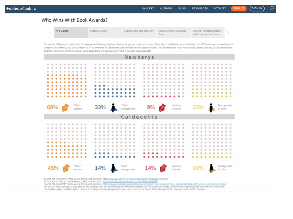
As mentioned above, users can examine our data visualizations on our website by clicking on the “Findings” tab. Once there, they can view the data on that page or click the link to view on Tableau Public. Our visualizations are separated into five sections that each go into more depth on several aspects of our data. We put our visuals in “Story” format to make it easier for the viewer to go back and forth between visualizations. Having to continuously scroll up and down can be distracting and may cause some discontinuity between the data. On each slide, users can filter by organization (Newbery, Caldecott or All) as well as by award (Honor, Medal or All). This allows our audience to interact with the data and see how it changes by using different combinations. The colors of the visualizations mirror those found on our website. Users can move through the slides using the arrows on the bottom of our visualizations as well as make the display full screen. They can also share and/or download our findings. 

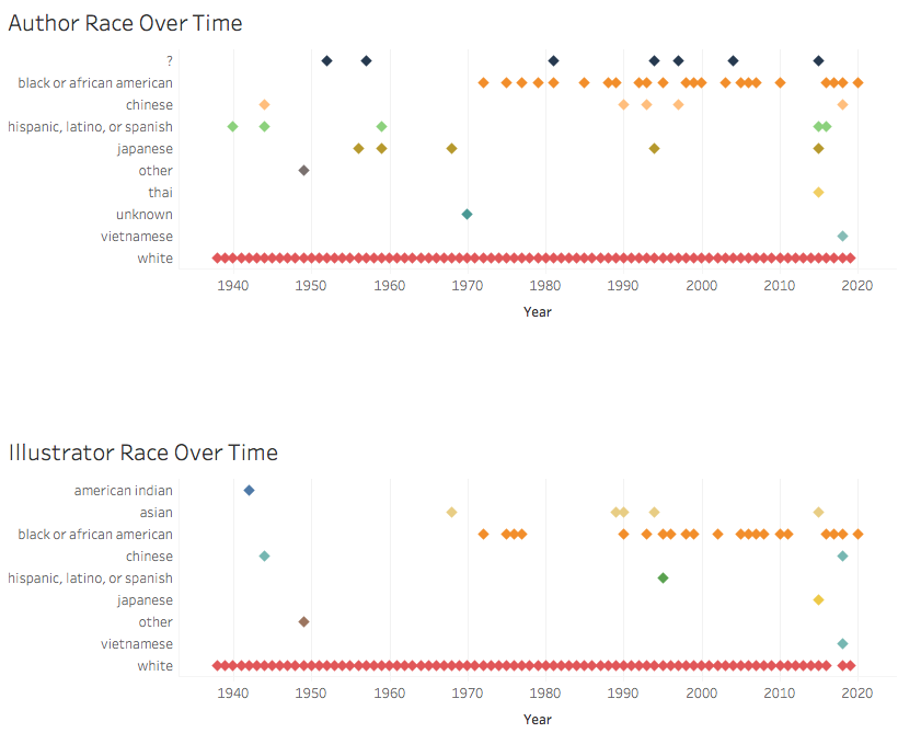
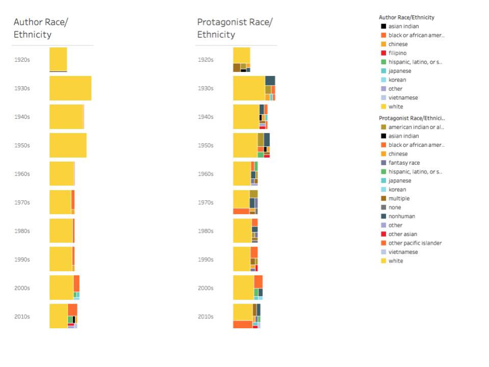
In our Story, the first slide, “At a Glance,” starts by discussing the influence of Newberys and Caldecotts on the purchasing of children’s books, and as the title suggests, gives a brief glimpse into the data regarding authors and protagonists. The next slide, titled “Explore Gender”’ looks at how gender, indicated by “he” and “she” in the books and author bios, compares between awards for both protagonists and authors. “Explore Race and Ethnicity” is the next slide, and it explores the races and ethnicities that are found in these book award winners and honorees. Our next slide continues examining race and ethnicity but looks at these aspects in relation to authors over time. Our final slide, “Explore Protagonist Race and Ethnicity over Time,” gives users the opportunity to explore how protagonist race and ethnicity has changed over the history of these two book awards. 

Tableau Story View

Evaluation 

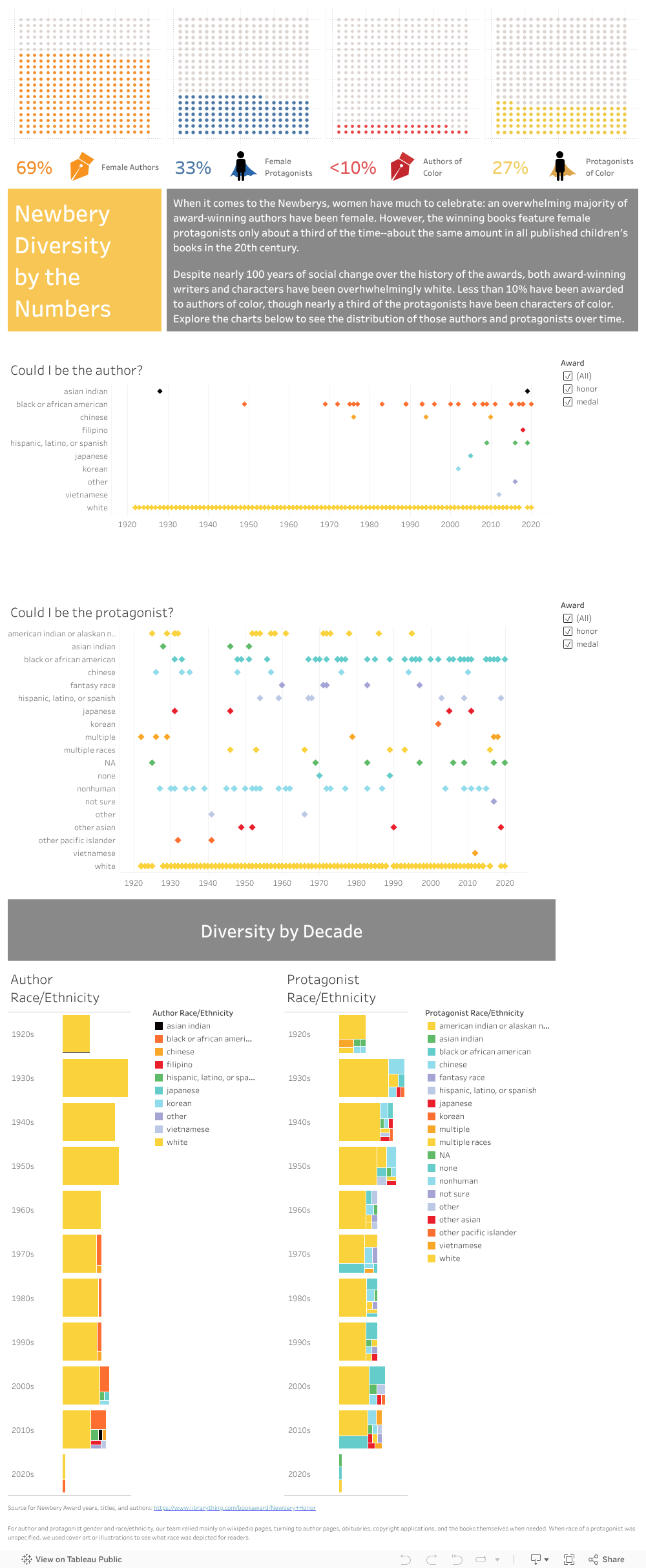
Throughout our project’s development, we sought feedback from fellow digital humanists as well as from members of our intended audience. We started with those associated with our program—Micki Kaufman, Advisor to the Master of Arts in Digital Humanities Program, and Steven Zweibel, Data and Digital Projects Librarian at the Graduate Center. Kaufman encouraged us to consider our data from new angles—to push against the boundaries that informed our visualizations. We followed that advice, creating counterfactual representations, such as those without white authors or protagonists, and investigating the effects of slicing time in different ways, such as looking at diversity by decades rather than individual years. 

According to our second round of feedback, the counterfactual representations were not terribly effective, since there was early (though unsustained) recognition of authors and protagonists of color. The view by decades, pictured below, was aesthetically interesting, but feedback from librarians and teachers suggested that the view seemed artificial—that the irregular spacing of eras and movements render regular, ten-year increments less meaningful than less tidy divisions, such as years bookending wars or social movements. Still, that feedback helped us rule out potential paths of inquiry and reinforced the analysis of our initial findings.

Race/Ethnicity 
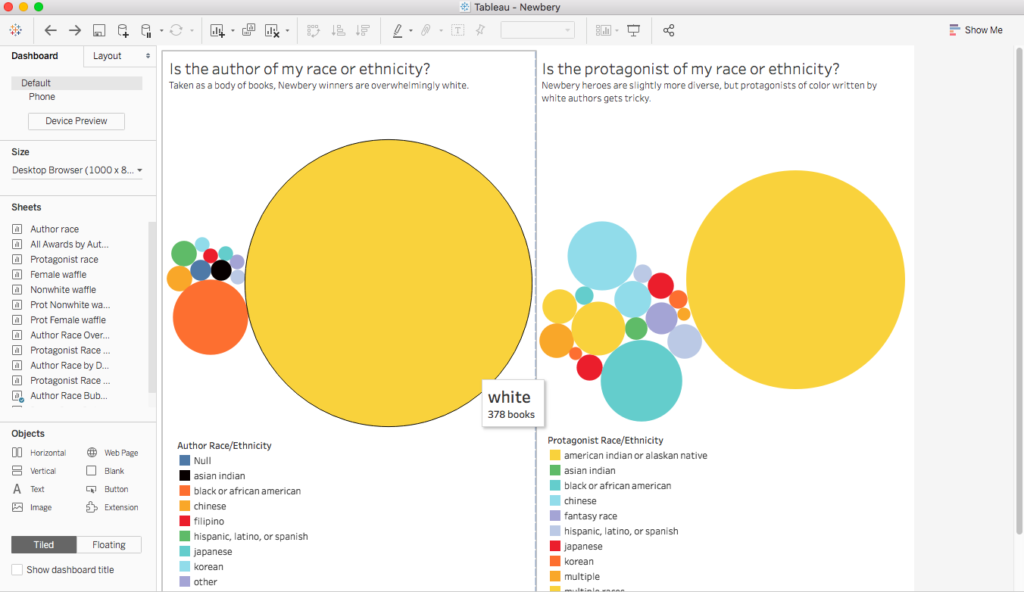
Steven Zweibel, as a digital humanist, librarian, and father of a young reader, represents a cross-section of our intended users, and his feedback helped us evaluate how well we spoke to those distinct audiences. He recommended leveraging the power of area to demonstrate our biggest insight—the overwhelming whiteness of award-winning authors and protagonists. We did this with bubble charts on race and ethnicity. Those charts provide the analytical context through which our longitudinal data can be viewed.

We then reached out to a host of parents, educators, librarians, and academics in the field of education. The first wave led us to simplify our view, relying on Tableau’s story format to reduce the length of our Tableau page to more palatable and focused chunks. Subsequent waves helped us tweak language and add clarity. For example, K.T. Horning, director of the Cooperative Children’s Book Center of the School of Education at the University of Wisconsin–Madison, noted that, since the Caldecott awards are granted to the illustrators of the award-winning books, we may need to include the role along with that of “author.” Most respondents noted that questions generated by the waffle charts were answered in the subsequent slides of the Story, such as how we dealt with nonbinary gender, why we chose the racial and ethnic categories, and what markers were granted to animal and nonhuman protagonists. As Katy Wischow, Senior Staff Developer at Columbia Teachers College Reading and Writing Project put it, “All the things I initially thought to suggest when looking at the project (like how nonbinary/trans authors fit in) you later addressed.” One respondent, a middle-school librarian, asked bluntly where the Jewish authors were, pointing to a layer of data we wanted to  include this round but had to save for our expansion, partially because the COVID-19 outbreak kept us from visiting libraries. 

Even with this limitation, our research unearthed layers of race and ethnicity beyond the Census categories. Using the 2020 Census lens, white can mean Anglo-Saxon, but it can also mean Middle Eastern, Italian, Irish, Jewish, Swedish, and a host of other heritages and religions. Over the course of the near century of these awards, such degrees of whiteness have, indeed, represented important layers of diversity—groups of people marginalized or rarely reflected in mainstream children’s literature. We opted to save this level of data for our project’s expansion, as it means moving beyond the Census categories—a complicated task we could not complete before public launch. 

What was, perhaps, the most gratifying feedback came from 64 independent-school 7th graders from the Chapin School who got to review the data after a virtual presentation from 2020 Newbery Award-winning author Jerry Craft. These 12 and 13-year-olds provided a test of the clarity of our project. Like many digital humanists, we worried that the value of our research might get lost behind the theory. Though we consulted articles, debated about what racial and ethnic categories to use, and investigated the philosophy behind data visualization, we have ultimately designed our work to change minds and spending habits. So, clarity is essential. 

These young viewers, unsteeped in societal complexity, asked many of the questions we asked and drew many of the conclusions we drew. Upon seeing the waffle charts, one student said, “Well, it’s cool that most of the Newbery authors have been women, so why aren’t more protagonists female?” Another responded, “I’m not surprised so many authors are women, since society often thinks of them as caretakers. You know, like moms.“ Another replied, “Yeah. It’s the same with the authors of color. First, there are so few. I mean, I thought there wouldn’t be many. But less than 10%? And then look at the protagonists. How real can those stories be if white people are writing them?” Given the conclusions they were able to draw without prompting, our visualizations seemed to be as clear and persuasive as we had hoped.

More importantly, these young reviewers provided suggestions for ways to expand the data. One student asked whether we tracked genre. She wanted to know if “she” authors tended to write a particular kind of book. Another student asked if the relatively balanced ratio of “he” to “she” authors in the Caldecotts had to do with illustration. Since many of those books are illustrated by a person other than the author, she wondered whether those roles break down in interesting ways by gender. Thanks to these curious students, we hope to tackle these new questions in the coming year.

Of course, in addition to outside evaluation, we have also evaluated the project ourselves. We believe that the data and initial line of inquiry have been the strengths of our project. Our findings communicate trends in gender and race in Newbery and Caldecott awards winners. These titles drive sales, launch careers, and shape how children see their place in the world. Going forward, we hope to leverage more fully our website and social media accounts. During the development stage, we devoted the majority of our time to gathering and creating, so we now hope to promote our results through more robust blogging and targeted Tweeting.

Continuation

During Summer 2020, our group plans to continue working on and iterating this project. Our website will continue to be hosted on the CUNY Academic Commons and will be updated periodically with new posts. We hope to add data that will give more context to our visualizations. As noted in the evaluation section, we wish to explore genre and how it intersects with gender, race, and ethnicity in book awards. We would like to make our next-level data, such as author/illustrator roles, visible in edited tooltips and additional visualizations, while we investigate ways to break out of what we consider the distorting structure of the Census categories, where Asian ethnicity is broken up into distinct countries, while continental African identity is lumped with African American. We also hope to expand to other book awards to take a comprehensive look at their diversity. 

With a new school year on the horizon, we plan to get more proactive in our social media presence as well; we are eager to push our project (and its summer updates) in the early fall, as teachers set up their classrooms. We believe that some enhanced writing on the website may draw more people into dialogue with our project, and we have already received some interest for conference presentations and a write up for The Horn Book magazine, a journal about children’s literature.

Works Cited

Association for Library Services to Children-ALSC. (n.d.). Caldecott Medal Homepage. http://www.ala.org/alsc/awardsgrants/bookmedia/caldecottmedal/caldecottmedal

Association for Library Services to Children-ALSC. (n.d.) Newbery Medal Homepage. http://www.ala.org/alsc/awardsgrants/bookmedia/newberymedal/newberymedal

Bartle, Lisa. Database of Award-Winning Children’s Literature, www.dawcl.com

Bishop, Rudine Sims. “Mirrors, Windows, and Sliding Glass Doors.” Perspectives: Choosing and Using Books for the Classroom Vol 6, no 3. 1990.

Cockcroft, Marlaina. ‘Caldecott and Newbery Medal Wins Bring Instant Boost to Book Sales’. SLJ, February 10, 2018.

https://www.slj.com/?detailStory=caldecott-newbery-medals-translate-bigger-short-term-sales

Cooperative Children’s Book Center. (n.d.). https://ccbc.education.wisc.edu/

Diverse Book Finder. (n.d.). https://diversebookfinder.org/

Du Bois, W.E.B. “The True Brownies.” The Crisis 18. 1919.

The Institute of Museum and Library Services. (2019, May). Public Libraries in the United States Fiscal Year 2016. Washington, DC: The Institute. https://www.imls.gov/publications/public-libraries-united-states-survey-fiscal-year-2016

McCabe, Janice, et al. “Gender in Twentieth-Century Children’s Books: Patterns of Disparity in Titles and Central Characters.” Gender and Society, vol. 25, no. 2, 2011, pp. 197–226. JSTOR, www.jstor.org/stable/23044136. Accessed 24 May 2020.

Michigan State University Library, (n.d.). Multicultural and Diverse Children’s Literature LibGuides. http://libguides.lib.msu.edu/c.php?g=96613&p=626684

Research on Diversity in Youth Literature (RDYL) St. Catherine University     https://sophia.stkate.edu/rdyl/about.html

Scholastic, Inc. The Power of Story: Diverse Books for All Readers. (n.d.). https://kids.scholastic.com/kids/books/power-of-story/

Yorio, Kara. ‘Librarians Love to Share Award Winners with Kids’ SLJ, February 6, 2018  https://www.slj.com/?detailStory=librarians-love-share-award-winners-kids


Heritage Reconstructed: Virtualizations of Archaeological Sites in Peril

Group Members

Christofer Gass: Lead Developer, Lead UX Designer

Christofer contributed to the Heritage Reconstructed project as a Lead Developer and Lead UX Designer. His roles consisted of working on the website, adding sites to the Omeka database and creating the map in Tableau. He also assisted with research, along with other group members.

Marcela F. González: Research/Documentation

Marcela contributed to the Heritage Reconstructed project through research and documentation. She gathered the data for the sites that we put into the database. In addition, she gathered data for sites that were in peril but did not have virtual reconstructions so that we can compare the two data sets and represent the importance of virtual reconstructions for such sites.

Margael St Juste: Social Media and Outreach

Margael was the outreach coordinator for the Heritage Reconstructed project. She was in charge of email communications with academics and digital scholars, including those whose work serves as the foundation of our project. In addition, she promoted public conversation about the project on social media platforms as well as within digital humanities spaces.

Ashley Rojas: Project Manager, Developer, UX Designer

Ashley was the Project Manager for Heritage Reconstructed, as well as one of the Developers and UX/UI Designers. As Project Manager, she ensured the group remained organized and on task as well as providing support for all areas of the project that needed assistance. As a Developer, she worked on the website and database. As a UX/UI Designer, she made sure that Heritage Reconstructed reached its intended audience through design and representation.

We have also received assistance throughout the semester from the following Graduate Center faculty and staff: Dr. Bret Maney, Professor Lisa Rhody, Steve Zweibel, Micki Kaufman and Jason Nielsen.


Project Narrative

Within the world of archaeology, combining virtual reality with archaeological data has allowed individuals to experience cultures that are no longer around today. Such projects include Learning Sites Inc., Project Collart-Palmyre, and Google Arts and Culture: Open Heritage. Many projects, however, are not openly available to the public. In addition, there is not a large focus placed on the virtual reconstruction of archaeological sites. Sites that we are at risk of losing due to factors such as political unrest, warfare, and environmental impact, should be the ones focused on when institutions or companies are looking to create virtual reconstructions. The goal of Heritage Reconstructed: Virtualizations of Archaeological Sites in Peril is to allow for an online open database to hold virtual reconstructions of archaeological sites that have already been digitally reconstructed and have either been destroyed or are in peril. It will also look at the sites that are classified as in peril but have not been virtually reconstructed to see the scope of sites that should be focused on. Heritage Reconstructed will not only be for academic or scholarly use, but to be used in pedagogy and for those who may have an interest in the topics who either do not know where to start, or do not have access to the information outside of academia.

Virtual reality methods have been used for almost three decades in the field of cultural heritage, specifically, for the reconstruction, visualization, and interpretation of archaeological sites. The Heritage Reconstructed database is organized following two selection criteria: first, we focused on archaeological sites — sites that required human intervention and may include cultural artifacts, architecture, art, religious buildings and objects — as opposed to natural sites (such as national parks). Second, we focused on archaeological sites in peril due to armed conflict, terrorism, war, and environmental damages such as natural disasters and pollution. This delimitation of the scope of the sites that we include in our database is important because it gives our project a strong, conceptual lens and a clear standpoint to engage our VR digital project with others that are already being developed by different individuals and institutions: scholars in universities, people in the game industry, artists, start-ups, among others.

Our digital project engages with different digital projects built by institutions and individuals whose aim is pretty close to our aim, for example, ICONEM, which is dedicated to the digitization of endangered cultural heritage sites; Rekrei, a crowdsourced project, which also creates 3D representations of sites in danger; CyArc-ICOMOS-Google which created five VRs of sites taken from World Heritage In Danger (UNESCO) list that are mostly in danger due to climate change. Unlike these organizations, we are not creators of VRs, but we built a database of VRs that amplifies and enhances their work. In a sense, our digital project differs from others because we see ourselves as facilitators of conversations and enablers of future projects by putting together and disseminating VRs that are either private or public but isolated from one another.

Additionally, our broader perspective of the field of virtual reconstruction of archaeological sites in peril allows us to identify what has been done, and more importantly, what still needs to be done. Our main reference for this was the UNESCO In Danger list because we had already identified many sites considered archaeological sites in peril for which there are no VRs available, at least to the best of our knowledge. Our work in identifying archaeological sites in peril for which there are no VRs, however, is not limited to those sites included in the UNESCO In Danger list. Our work goes beyond this list. This is an important contribution we aim to make in the field; by identifying archaeological sites in peril that have yet to call attention to any institution or individual yet.


Audience

The idea of ‘audience’ was central to how we executed our vision of Heritage Reconstructed. From the day we sat down to discuss the project we were already thinking about the user on the front-end of a computer screen and how our project would serve them. We continuously questioned for whom we were building this project, where will we find them, and how will they find our project? In one of our earliest class meetings, Professor Lisa Rhody had urged us to think about the audience as a guiding element of our design process. If we could identify our primary audience, we could envision them as individual users. We could picture what we would want them to experience. Using our primary audience to guide our design process helped us to clarify some important goals very early on. Even when we struggled in other aspects, like task completion, having clear goals helped us  to see the bigger picture and move forward.

Because the concept of audience was tied-in very early in the development process, it became instrumental to our decision making. Questions such as where to host our database, what design elements to choose or discard, and how to connect the features of our website to tell a story our audience will understand were all contingent on who we believed our audience to be. One such feature was incorporating our Twitter feed on our website, another was hosting our database on Omeka.net to allow for the virtual reconstructions to be directly embedded into the page as opposed to externally linked. Our project became centered around its utility to the user. We wanted our database to be easy to navigate and to contain information that the audience would find valuable and useful.

We built Heritage Reconstructed as an open database for a public audience which otherwise may not be able to access these archeological reconstructions. So, at the core of the project, we always envisioned an audience facing some sort of institutional or infrastructural barrier related to education or accessibility. These barriers may be in the form of not having access to higher education, not having access to professional/academic connections in the field, and/or not having access to private databases. This project is one resource that teachers, particularly in the U.S public education system, can use to introduce the topic of 3D/VR archeological reconstructions to their students without having to pay for a subscription to a journal or private database. This is also a resource for students who are exploring topics in virtual reconstruction and archeological perils and simply want somewhere to start.

The work of Heritage Reconstructed, however, goes beyond addressing the need to reach a general audience with accessibility barriers. As we worked on the project, one issue that became very clear was the restricted availability of  reconstructions for sites in peril as a classification of sites. It is hard to find a community agenda for sites in peril in the active communities of 3D/VR reconstruction creators. Among the UNESCO In Danger sites that we used to initiate our research process, 53 sites (about 43 archaeological sites and 10 cultural sites such as parks) were classified as in peril and only about 16 archaeological sites had publicly accessible 3D/VR reconstructions. As a result, the people most entrenched in the systems of 3D/VR archeological reconstructions have become a secondary audience for our work — amongst them the VR tech firms, the VR archeological journals, and the museum departments entering the VR reconstruction space. Our goal is to start a larger conversation about the reality of existential perils facing archeological sites and the unavailability of 3D/VR reconstructions of those sites. We envision our project being valuable to these creators as an audience because we are generating a conversation about a topic that directly impacts the work that they do. The crisis of archeological peril cannot be divorced from the objects they work with and as a result must be addressed in future projects.


Project Activities

Initially, our goal was to create a virtual reality database on archaeological sites. The first few classes, we focused on discussing what we meant by archaeological sites; whether we would focus on a particular region or historical period. We realized that we needed to delimit our objects, but it was not until subsequent meetings that we were able to specifically identify the content of our database.

It was illuminating for us when we decided that we would focus on archaeological sites in peril because it gave us a clear understanding of what our project would be and what kind of research we needed to do. The second discussion we had was whether we would focus on a country and/or region of the world, and whether we would focus on a particular historical period. We left this open and it turned out to be a good decision because we identified three patterns in our search of VR. First, there are not many VRs for the sites that UNESCO considers to be in peril. Second, the VRs that are available are created for countries and archaeological sites that come from the same geographical region and are mostly in peril or were destroyed by war and terrorist groups (e.g., Iraq, Libya, Syria, and Afghanistan). Third, the VRs available are created for countries and archaeological sites that are very well known (e.g. Italy and Greece).

The third discussion was whether we would include natural sites in danger (e.g., parks), besides archeological sites or objects in peril. We decided to include only VRs of archeological sites, for example, architecture, art, and/or religious buildings. Once we defined these criteria, the purpose of our VR digital project became clearer for all of us, not only in a practical sense, but rather by giving us a better understanding of the project we wanted to create. After proposing different names for our digital project and further discussion, we were able to finalize the name for our project.


Accomplishments

From the beginning, we knew we wanted to have our database online and openly available to the public. Since our audience is not exclusive to those in academia, we also knew that the information would have to be displayed in a welcoming and easy-to-follow way. The project consists of a Twitter account, Gmail account, GitHub account, website made with HTML and CSS, and an Omeka Database.

Twitter and Gmail Accounts

Once we made a final decision about the name of our project, we started to build an outreach plan. We created a Gmail account, along with a Google Drive folder that everyone in the group had access to. This allowed for a fluid data management system. Whenever a member contributed to the project folder on Google Drive, it was available for any member of the group to review and comment on. As a result, we collectively shared all the milestones of the project whether we directly contributed or not. Google Drive is also an effective task delivery system with the option to assign tasks from Google Docs, send notification emails, etc. In addition to Google Drive, we made ample use of Gmail. We used our Gmail to send emails to a number of academics, introducing our project in the early stages. We also used it to track Google Alerts that we had created for certain keyword terms relevant to our project. These keyword terms included “Heritage Conservation”, “Digital Reconstruction”, “Virtual Reconstruction”, “Sites in Peril”, “Archeological Reconstruction”, etc. We also used our Gmail account to create our social media presence on Twitter. Several times, our Google Alerts brought our attention to articles that we then shared on Twitter. Twitter often served as a place to observe and learn what these communities of creators were doing. At times, we used a number of hashtags to connect our work through a retweet of another 3D/VR creator’s work. Twitter remains a central place to promote our project by allowing users to connect to our database from our page and allowing us to quantitatively measure interactions with our content.

Main Website

Our vision of the website from the beginning included the view of our Twitter feed on the page to keep our visitors engaged with our conversations on social media and up to date with current information. One way to accomplish this was to create our own static pages using HTML and CSS. The HTML and CSS utilized for the website pages, in addition to the HTML used within the database, was learned from Patrick Smyth’s Software Design Lab, and tutorials from W3Schools Online Web Tutorials and WebDevTrick.com for the footer. An additional feature is the loader. The loader is important for cleanly representing the website after everything on the page has been loaded. The pages of the website have a color and font scheme that is meant to replicate the Omeka database.

Once we had our web pages ready, we decided to host them through GitHub Pages using a GitHub account for our project. Github Pages allows us to host our webpages for free with all the freedom and flexibility HTML or CSS allows us. It also allows us to easily add to or update the pages at any time. Since GitHub Pages is also a free to use service, we did not have to worry about costs related to keeping the website up and running. The website can also be available for as long as GitHub Pages is around. GitHub also allows for us to keep track of any changes made to the website over time. Once the website was launched at the GC Digital Showcase, we decided to add Google Analytics to the website so that we can keep track of how many people visit the website. Google Analytics is also a free service used to keep track of visitor traffic.

Omeka Database

When thinking about what we wanted to do for the website, our primary focus was on the database, since it is the main aspect of the project. We started looking into Omeka.net since it is specialized for collections database management. Omeka is used by thousands of institutions and organizations across the US and all over the globe. The Berlin theme is a simple layout that is one of two that are preloaded and makes the content easily accessible. The database focuses on the use of items which are then described by using the Dublin Core Metadata Initiative. Although we are working with images and videos of digital reconstructions, in addition to digital reconstructions themselves, we have been able to showcase all these different types of formats. This aspect, along with the added feature of exhibitions, made Omeka the perfect platform for us. We created a free account with Omeka.net through the Trial plan which allows the unlimited use of one site with 500MB of storage space.

Heritage-Reconstructed-Database-Home

Figure 1. Heritage Reconstructed Database Exhibits Page

Website and Database Overview

To ensure easier readability for individuals who use screen readers, we constructed the HTML to begin with the first item of the menu and when the ‘tab’ button is pressed the item selected to activate goes through each of the items, left to right, before going through the main body of text. The reader is then brought to our embedded Twitter account, which lists the four most recent posts from most recent to older, before being brought through each of the items in the footer from top to bottom and left to right. The pages of the website consist of ‘Home’, ‘Methods’, ‘Mission’, ‘Team’, ‘Resources’, and ‘Database’. The ‘Home’ page has a basic description and background of the project. The ‘Methods’ page describes the data utilized for the database, a description of the website and database, and an embedded map created in Tableau that represents the items in the database. The points can be clicked to be brought to the item in the Omeka Database. The ‘Mission’ page informs of the preservation, accessibility, education, and why the project is important. The ‘Team’ page gives a brief biography of the four team members. The ‘Resources’ page lists links the team has come across throughout the duration of the project. Here, links are broken up by ‘Archaeology Resources’, ‘Other VR Projects’, and ‘Other Similar Projects/Databases’.

Heritage-Reconstructed-Website-Home

Figure 2. Heritage Reconstructed Webpage Home

The ‘Database’ page directs the viewer to the Omeka database. The database at the moment, contains 11 items. In a similar manner as the webpage, when pressing the ‘tab’ key the item selected within the page runs though the title, menu, description, and footer items from left to right. When initially directed to the database the viewer is first brought to an exhibits page. The exhibits page has three different exhibits and they are broken up by ‘type’, ‘country’, ‘peril’. Each of the exhibits have a description with an image of one of the items in the exhibit. Once the exhibit is clicked on a page with the title, description, and list of the types within the exhibit. For each of the items in the database a Dublin Core schema is utilized which includes title, subject, description, creator, publisher, date, rights, format, language, type, identifier, coverage, URL, files, and tags.

Example-Database-Item-Page

Figure 3. Heritage Reconstructed Example Item Page: Item displayed is titled “Ancient Aztec Tenochtitlan”


Evaluation

Narrowing Scope

At first, we wanted to include any virtual reconstructions that were available online for any archaeological sites. This, however, was difficult to search for, not because there is too much out there, but because there is not enough that is publicly available. Through discussions with Professor Maney, he suggested that we think of a focus for the database by searching for certain archaeological sites, focusing on the question “besides just being virtual reconstructions of archaeological sites, why are these reconstructions important?” After this discussion, we came across the UNESCO In Danger list and the Open Heritage 3D project, which included some sites that a few group members recognized as having virtual reconstructions created already. This led to the focus on sites that had either been destroyed already or are in peril. Since there are not many virtual reconstructions publically available to begin with, we decided to shift the focus to, not only housing the reconstructions, but having the project act as a platform to discuss the importance of creating virtual reconstructions for archaeological sites in peril. By using the UNESCO In Danger list, we were able to see if any or all of the sites on the list had virtual reconstructions.

Representing our Data

When first presenting our website and database to our peers and a Digital Fellow at the Graduate Center, Micki Kaufman, she suggested that we include an interactive map that shows the different sites in order to have a visual representation of the sites in our database. Using this suggestion, we created a map in Tableau that maps the location of each item in our database. We embedded this map on the ‘Methods’ page of our website. As we continue to add more sites to the database, and thus the map, we will look into putting the map on to its own page, as was suggested by Professor Maney.

Another suggestion provided by Professor Maney was to create a landing page when a visitor goes to the database. Although the database is linked through the website, there is a possibility that someone will either find the database on its own (if through a web search) or if they click to the database without reading about our project first on the website. In order to mitigate any confusion that may arise when going straight to the database, we decided to utilize the exhibits feature that Omeka has to create three exhibits that lays out all of our items by type of reconstruction, type of peril and country. This allows a way for any visitor to be guided through the database and have a basic understanding of what the database is about.

Website Traffic

One suggestion that arose at the GC Digital Showcase was the idea of keeping track of visitors to the website. Since GitHub Pages only hosts our code for the website, it does not allow for the option of keeping track of visitors to the website. In this case, we decided to use Google Analytics as a way to track visitors since we already had a Google account for the project and the service was free. All we had to do was add some code at the top of all of the pages of the website. It is unfortunate that we did not think of this sooner to be able to keep track of all visitors from earlier in the project’s creation. This could have helped us when it came to our social media outreach. We could have seen what actions were successful in bringing people to our website, which, in turn, could have altered the way we reached out to people. In addition, we were only able to add Google Analytics to the website and not the database itself. Although Omeka allows for a Google Analytics plug-in, this is only available for paid plans.


Future of the Project/Sustainability

Social Media and Outreach

Although we have some ideas about the audience we hope interacts with our projects, pinpointing that audience in the online universe has been a harder feat. We will continue our efforts (including the use of social media) to give audiences a chance to discover our project. In the meantime we are reaching out to the professional connections, mostly CUNY professors in the archeological departments at several campuses, who already have a built-in audience whom we think will find this project useful.

One of the unique things about Heritage Reconstructed is that it straddles the spheres of virtual reality, archeological conservation and is intended as a pedagogical tool. These learning communities are unlikely to overlap in digital working groups even though their work perfectly intersects in a project like Heritage Reconstructed. Our long term goal is to promote interdisciplinary exchange in digital working groups for much needed projects like Heritage Reconstructed. We also want to keep the project running for as long as possible after we wrap up the spring semester. We want to continue to engage these divergent communities by updating our database regularly with new developments in VR/3D reconstructions for sites in peril. We will continue to create awareness on the topics of preservation and accessibility through our published content and social media interactions.

We hope that with continued interdisciplinary explorations of VR technologies in traditional fields like archeology, more people will create more publicly accessible resources for pedagogy.  We also hope that Heritage Reconstructed will provoke a higher percentage of the 3D/VR creator community to start exploring the classification of sites in peril as a primary subject. The existential perils facing archeological sites presents an opportunity for collaboration among 3D/VR creators and heritage conservators to really dig into the disparities that have surfaced in the availability of 3D/VR reconstructions for those sites, as well as the limited regional scope of what’s available. That is something that future 3D/VR reconstruction creators must address.

Journal Publication

We are planning to write an article on the use of our virtual reconstruction database in classrooms, either through assignments or during class time. With the shift from in-person classes to online classes, students need online resources now more than before. We aim to reflect in the article on some issues related to digital pedagogy, and at a more practical level, on what kinds of projects students can develop with our database, with the aim of enhancing their historical, cultural but also their digital skills. Initially, the journal we have in mind is the Journal of Interactive Technology and Pedagogy.

Website and Database

Although the semester is over, the database will continue to be updated. Once a new site has been recognized, it will be entered manually or, if there are many to add, a CSV can be utilized to import them en masse. Once the sites are added to the group’s Omeka database as an item, they will then be grouped in each of the three exhibits for the database.The site or sites will then be added to the map portion of the project which will in turn connect back to the database. There will be a WARC file of the Omeka database at the time of course completion and added to the group’s GitHub repository.

The Tableau map is up to date and will continue to be updated. The profile currently used is Christofer’s Tableau Public account. For as long as there is access to this software, the map will continue to be added to. If access to Tableau becomes disconnected, another mapping source will be used. Other software platforms that could be used are ArcGIS or QGIS. The Tableau map of Heritage Reconstructed sites will be made into a WARC file at time of course completion and added to the group’s GitHub repository.

Although the website page will be kept the same for the most part, it will be updated if and when needed. The group will work to ensure account accessibility to Heritage Reconstructed’s GitHub repository so that the project website will be kept ‘live’ for the next few years so all users can still openly navigate to the group’s site. A WARC file of the website pages will be made of all pages at time of course completion and added to the group’s GitHub repository.


Works Cited

Google Arts & Culture. (n.d.). Open Heritage. https://artsandculture.google.com/project/cyark

Learning Sites Inc. (2020, April 27). Welcome to Learning Sites Inc. http://www.learningsites.com/

Open Heritage 3D. (n.d.). https://openheritage3d.org/

Project Collart-Palmyre. (n.d.). http://wp.unil.ch/collart-palmyre/

Refsnes Data. (n.d.). W3Schools Online Web Tutorials. https://www.w3schools.com/

Shaan. (2019, May 17). HTML CSS Footer With Responsive Design | Fixed Bottom Footer. WebDevTrick.com. https://webdevtrick.com/html-css-footer/

UNESCO World Heritage Center. (n.d.). World Heritage in Danger. http://whc.unesco.org/en/158/


Heritage Reconstructed Website Link: https://hreconstructed.github.io/

World Fair 64

A beta version of my python text-based game file can be downloaded from the link above to be played in the command line, if you have python 3 already installed. If not, you can copy the code to paste in an online python 3 text editor. I have been using Trinket, but if you have any other recommendations or alternatives please share. Also, any and all advice would be greatly appreciated regarding the game. I hope you enjoy, thank you!

Heritage Reconstructed

This blog post is a draft of what will be included in the methods page in the Heritage Reconstructed site. Our aim is to explain our criteria to select the cases (VRs), our technique to find them, and what patterns we have identified based on the VRs we found.

Virtual Reality methods have been used for almost three decades in the field of cultural heritage, specifically, for the reconstruction, visualization, and interpretation of archaeological sites. The Virtual Reconstruction database is organized following two selection criteria: first, we focus on sites that, unlike natural sites, these sites required human intervention and creation, and may include cultural artifacts, architecture, art, religious buildings and objects. Second, we focus on archaeological sites in peril due to poaching, armed conflict, terrorism, war, and environmental damages such as natural disasters and pollution.

We selected the VRs following a snowball technique. First, we explored the UNESCO Word Heritage in danger list. The list includes 53 sites in danger and includes cultural (archaeological) sites and natural sites. We only focused on archaeological sites. We made a search of VRs available online country by country, using different key words to make the search. The UNESCO list allowed us to find some start-ups, artists, and scholars that are also working on virtual reconstruction of archaeological sites in peril and have created VRs on the topic.

Having completed the search following the UNESCO’s list, we identified three patterns: one, there are not many VRs for the sites the UNESCO considers in peril. Second, the VRs available are done in countries and archaeological sites that come from the same geographical region and mostly are in peril, or were destroyed, by war and terrorist groups, e.g., Irak, Libya, Syria, and Afghanistan. Third, the VRs available are done in countries and archaeological sites that are very well known, e.g. Italy and Greece.


Final Newbery Group Update 4/29

The team has focused the last week on data collection and creating content, while reviewing our project plan and deliverables. In regards to our data, the Caldecotts are (for the most part) completed, data is being cleaned, and our existing visualizations are getting an upgrade. In our meeting, Emily and I reported on the Caldecott data and how essential the YouTube read alongs were when examining protagonists. While speaking with Meg and Kelly, we realized that we did not include gender for the animals and nonhuman protagonists (where available) and are going to work on filling that in before the 12th. For example, in Olvia by Ian Falconer, Olivia is a female pig. We originally labelled Olivia as just an animal, but we will now include gender. Authors will often assign gender to their animal and nonhuman protagonists, and it should be included in our analysis. During our meeting, Meg brought up an excellent point about how we are reporting gender in our data, and we had a tough but important discussion regarding our practices as well as our audience. I recommend everyone read Meg’s blog post for more information on the topic and our discussion: https://whowins.commons.gc.cuny.edu/2020/04/26/our-data-in-and-beyond-the-gender-binary/

While Kelly was waiting for the Caldecotts, she worked on the Newbery visualizations in Tableau. She changed the view to Story, making it easier for our audience to navigate through the visualizations. Kelly was also put in contact with a woman who has experience with Tableau. She shared tips and best practices, which Kelly will use with the Newbery and Caldecott data. 

With Kelly working on the visualizations, Meg, Emily, and I will work on completing blog posts for the website. Topics include the U.S. Census, how our research methods have changed due to covid-19, and other Book Awards that many parents and educators are unaware of. We will also continue to create content for Twitter, and participate in Day of DH 2020. We are focusing on Twitter to build interest for our project and share our methods, and will use our Instagram account to share our visualizations and graphics. Before the presentation on the 12th, we will review the website for any broken links and missing pages, and will do a final run through once we embed the visualizations on our site. We want to make sure that our visualizations will display properly and that our audience can successfully interact with them.

We are looking forward to the dress rehearsal next week and then launching our project at the GC Digital Showcase. I know that this has been a challenging semester for all of us, but I am proud of both my team and the Heritage Reconstruction team for what we have accomplished. 


Kelly’s Reflection: Week of 4/19 – 4/26

This week, I focused on readability and scale. As we now have four ways to look at the Newbery data (waffle chart overviews, race/ethnicity bubbles, race/ethnicity over time, and race/ethnicity by decade), our visualizations are becoming hard to navigate. So, I’ve played with the story feature of Tableau to reveal the data one layer at a time:

(Visit the Tableau Public viz for fuller functionality)

I also made parallel the color coding in the bubble charts, to make the data visually comparable from chart to chart.

In terms of scale, I began playing with the now nearly finished Caldecott data. My initial eyeballing had told me that the Caldecotts were more diverse, and they are, but hardly.

Charts of Caldecott author and illustrator race and ethnicity over time

Initial visualizations of Caldecott author and illustrator race and ethnicity

As with the Newbery set, these initial visualizations revealed a host of input errors, as we humans had entered data inconsistently, despite our best efforts to stick to pre-defined categories. So, I spent some time cleaning, though there’s still more to do and little time in which to do it. (You’ll notice in the above image, for example, the label of “Asian,” which is not a Census option).

Trickier still, the Caldecott awards are for illustrated works, which means that an honored book may have two or more creators. If we separate authors from illustrators, do we re-enter author data if they themselves are the illustrators, thereby over-representing their identity? Or, do we separate authors from illustrators, reducing the effect of the fact that perhaps readers of different backgrounds may find themselves represented in the authorship of the same book?

Those are the pressing issues as we wrap up our work this week. Also pressing is how best to contextualize our work in writing on our website. We are struggling as a team to balance when we are speaking to our intended audience and when we are appealing to academics who may already have a stake in our work. We are also grappling, as all data visualizers do, with when to compromise accuracy for the sake of clarity. For example, do we remove unidentifiable authors from the set? Do we distinguish between animal and non-animal protagonists? Do we continue to devote precious hours to the elusive authors and protagonists for whose identity we have scoured the web, CUNY’s online resources, and even the Social Security Death Index records?

One of our biggest questions throughout this project has been how we can label identity in a way that communicates to parents, educators, and librarians identity markers that may help children see themselves and others in books. Those labels are inherently flawed, especially as they are being applied over a century of data. We are experimenting with “she” and “he” as our gender categories, since those binary pronouns are the ones readers will encounter in author bios and in the texts themselves, but, of course, we have also committed to Census categories for race and ethnicity, which readers don’t encounter.

It is my hope that while the data brings up these problems, our site proposes a solution: choosing widely from the myriad book awards that actively seek to remedy the dangers of homogenous authorship.

Newbery Update 4/22

Stage Two: March 20th-April 19th:

  • Content Development: Complete the Google Spreadsheet for Caldecott Books. Tweak Tableau Interface, create visualizations; Start blogging on the Website.
  • Design: Finalize website design and add pages to the site (Caldecott, etc.)
  • Outreach & Publicity: Continue to RT content on diverse books/child literacy. 

Reviewing our Project Work Plan, we have hit most of our milestones. During the last two weeks, we focused on creating content for our social media accounts and blog. We also finalized our website design, and have added most of the pages. Regarding our data, we created Newbery visualizations and are sharing them for our next round of feedback.

We were delayed with the Caldecott data, specifically with the breakdown of protagonists, due to the shutdown. We had to get creative, finding read-alongs on YouTube and reaching out to scholars who published Caldecott articles and asking them to share some of their data. The read-alongs were very helpful when dealing with the older Caldecotts, and the scholars were happy to share parts of their work. We will finish the Caldecott Spreadsheet by the end of this week, and then will start playing with the data in Tableau. We are also ready to share some visualizations on our social media, with links to the website.

As we enter the final stage of the project, we are re-thinking our deliverables. In our initial project plan, we wanted to create printable visuals and infographics that librarians and educators could place in their libraries and classrooms. Since classes will be taught virtually for the rest of the school year, we will focus on visualizations that can be shared with our audience digitally. We will also write a blog discussing how covid-19 impacted our research and outreach plans for this project.

The weeks leading up to the presentation will be busy for us. Over the next week we will finish collecting the Caldecott data and start creating vizzes, as well as post more original content on our blog and social media pages. 

Heritage Reconstruction Group Update

Over the past two weeks, Heritage Reconstruction has thought about the questions that arose from our mock presentation. We have made edits to our database, created a map in ArcMap to start a springboard of conversation for a mapping aspect for our project, and continued to update our Twitter feed. Brett brought up a great point about the pros and cons of a digital map vs. more sites. As of right now, we are leaning towards a little of both. I provided a basic run-through of how to import a CSV to Omeka with the rest of the group after our class meeting and Marcela is determined to add another site before Thursday. We added one last night during the demo, but it is still ‘private’ and needs to be further updated. So, we are approaching the teens of objects in our database. The static map that was created will be revised and converted to Tableau to provide information within the tooltips. A wonderful point Marcela made was to make the Tableau tooltips direct the viewer to the object within our Omeka database, which seems manageable as a hyperlink. We are very excited about the last two weeks of hard work before our presentations in early May. Also, our webpage is continuously updated by our wonderful Twitter feed. While on the site, I am always captivated by the most recent tweet.
gass_unseco_map_2020


Kelly’s Reflection: Week of 4/12 – 4/19

This week I realized one huge, albeit obvious, difference between One Week | One Tool and DH70002: time. There must have been something quite liberating in the parameter of just one week’s worth of work. Granted, the intensity, publicity, and level of that experiment far surpass ours, yet I find myself envying the breakneck hastiness of that endeavor.

We, by contrast, have had weeks and weeks and weeks. But life has changed dramatically over that stretch of time. For me, for my group, and for our audience. I’m now a virtual teacher, and I live with five people instead of one. Our team has had brushes and direct hits with COVID-19. And our project has taken on greater meaning, as reading books has provided human connection for kids in a world struggling to isolate itself.

So, with just a few weeks before our final presentation, I find myself uneasy. Mostly because I’m just not sure which of the many decisions before me is most important—which warrants the greatest, last-ditch effort. We had originally planned to create a printable poster for librarians and educators to hang on their walls. They may not see those walls (or those printers) for quite some time. We wanted to broaden our scope to the Caldecotts. But, if they tell the same story (which it seems they do), is our time better served improving the power and reach of our Newbery visualizations? Ah, Hamlet. We get why you are so enduring.

My work in the last week has only strengthened my indecision. Following Micki’s advice, I made some good progress, creating a calculated field to sort the race and ethnicity of Newbery authors and protagonists by decade. Some parallel tree maps now chart the gross disproportion of whiteness across chunks of time, and clear tool tips help make the point that only in the last 20 years have we seen any real nod toward writer diversity. I added source notes to the visualizations as well and tackled some of the last few unknowns in our data.

That in place, I reached out for feedback to the inimitable Steven Zweibel—a particularly apt critic given his triple roles as DH guru, librarian, and father of a young reader. Like some Koan master, he answered questions with questions, prompting me to investigate the philosophy of tree maps, to present our data in different (albeit unnamed) ways, and to communicate with our users more fully. I tried the bubble charts below and retooled some older bar charts.

Bubble charts depicting race/ethnicity data of authors and protagonists

A stab at bubble charts for greater visual impact.

Then the team weighed back in during our weekly meeting, defending some of our original choices and embracing some of the new additions. And now, we’ll repeat the whole thing as we take this tweaked version to Meg’s contact at the NYPL, librarians at my school, and, hopefully, children’s lit folks at CUNY. Here’s how we stand now:

var divElement = document.getElementById(‘viz1587341718454’); var vizElement = divElement.getElementsByTagName(‘object’)[0]; if ( divElement.offsetWidth > 800 ) { vizElement.style.width=’1000px’;vizElement.style.height=’2427px’;} else if ( divElement.offsetWidth > 500 ) { vizElement.style.width=’1000px’;vizElement.style.height=’2427px’;} else { vizElement.style.width=’100%’;vizElement.style.height=’3377px’;} var scriptElement = document.createElement(‘script’); scriptElement.src = ‘https://public.tableau.com/javascripts/api/viz_v1.js’; vizElement.parentNode.insertBefore(scriptElement, vizElement);

Fortunately, all this angst has an upside: we can share it on the website and social media. We discussed in our meeting how we can tap into recent articles on Census deadline postponement to express our displeasure at its racial categories. We noted that some of the big questions our data has presented (is Pam Muñoz Ryan really “other” by Census standards?) provide a teaching opportunity. And we recognized that there are some gem stories that are begging to be spotlighted (what Johanna Drucker would call the “capta” trapped within the “data”).

Despite my indecision about next steps, I’ve promised the team I’d play with the Caldecott data this week, as it is nearly ready. As in the game of horseshoes, that’s good enough for a Tableau start. I’ll have to fight my own intellectual wanderlust, though, as some recent vizzes in Tableau’s gallery have me dreaming about a Sankey chart connecting authorship to protagonist identity. All I need is time…

Newbery Group Update 4/8

Following last week’s meetings and update, the team has spent their time working on the Caldecott data, Newbery vizzes, and our social media and outreach. We are almost done collecting the author and illustrator data and when complete, we will begin working on the protagonists. Emily and Georgette will search for the protagonists’ gender, race, and ethnicity. Once the Caldecott data is collected, Kelly will begin working with the data in Tableau. In the meantime, Kelly met with GC Digital Fellow Rafael Portela, and they reviewed the Python code Kelly created to scrape the Caldecott awardees. 

Regarding social media and outreach, we found more accounts to follow on Twitter and Instagram, and started creating original content. We were already following several DH programs and Newbery authors, so we added Caldecott authors/illustrators and related diversity projects and organizations. People of Color in Publishing (@PocPub), Latinx in Publishing (@LatinxinPub), Books for Kids Organization (@booksforkidsorg), and the Children’s Book Council (@CBCBook), just to name a few. We hope that when we share our vizzes, they will offer helpful feedback and promote our project when it is finished. This week we will continue to work on the following: 

Meg: I am going to write two 500 word blogs and automate postings to our social media accounts, including posting visualizations to Instagram. 

Emily: I will continue working on the Caldecott data, finishing up author/illustrator and then moving on to protagonists. I am planning on double-checking the data I collected with the articles Georgette found. I will be on the lookout for interesting content for our Twitter and Instagram pages.

Kelly: I got help from Rafa to understand how the Caldecott Python scrapes could have been more effective-something that will be great to play with if we continue the project beyond the scope of the course. I also continued to clean the data for the Newberys, as we now need outside feedback.

Finally, I played unsuccessfully so far with displaying the data counter-factually, as removing white people didn’t do much since there are some early authors and protagonists of color. But, I plan to play with grouping by decade and non-Census lenses as I have the next two days off. 

Georgette: I am finishing up collecting my portion of the author/illustrator Caldecott data, and will then move on to the protagonists. I will use the articles I found to double check my work on early honorees.